LOVEBIRDS
During quarantine, my father gave me the opportunity to make the visuals for one of his song. This project is about the loneliness and pain of being far from our loved ones. It explores a dystopian society where everyone is captive and separated.
THE IDEA
Lovebirds is first of all a love song that tells the story of a man kept away from the woman he loves. It illustrates true loneliness, the consequences of physical and mental isolation. The man is trapped in a Brutalist structure which represent a world he doesn’t believe in anymore, a world lacking purpose. While he’s singing for a way out of his prison, the visuals depict metaphorically the drifts of our modern society.
LYRICS
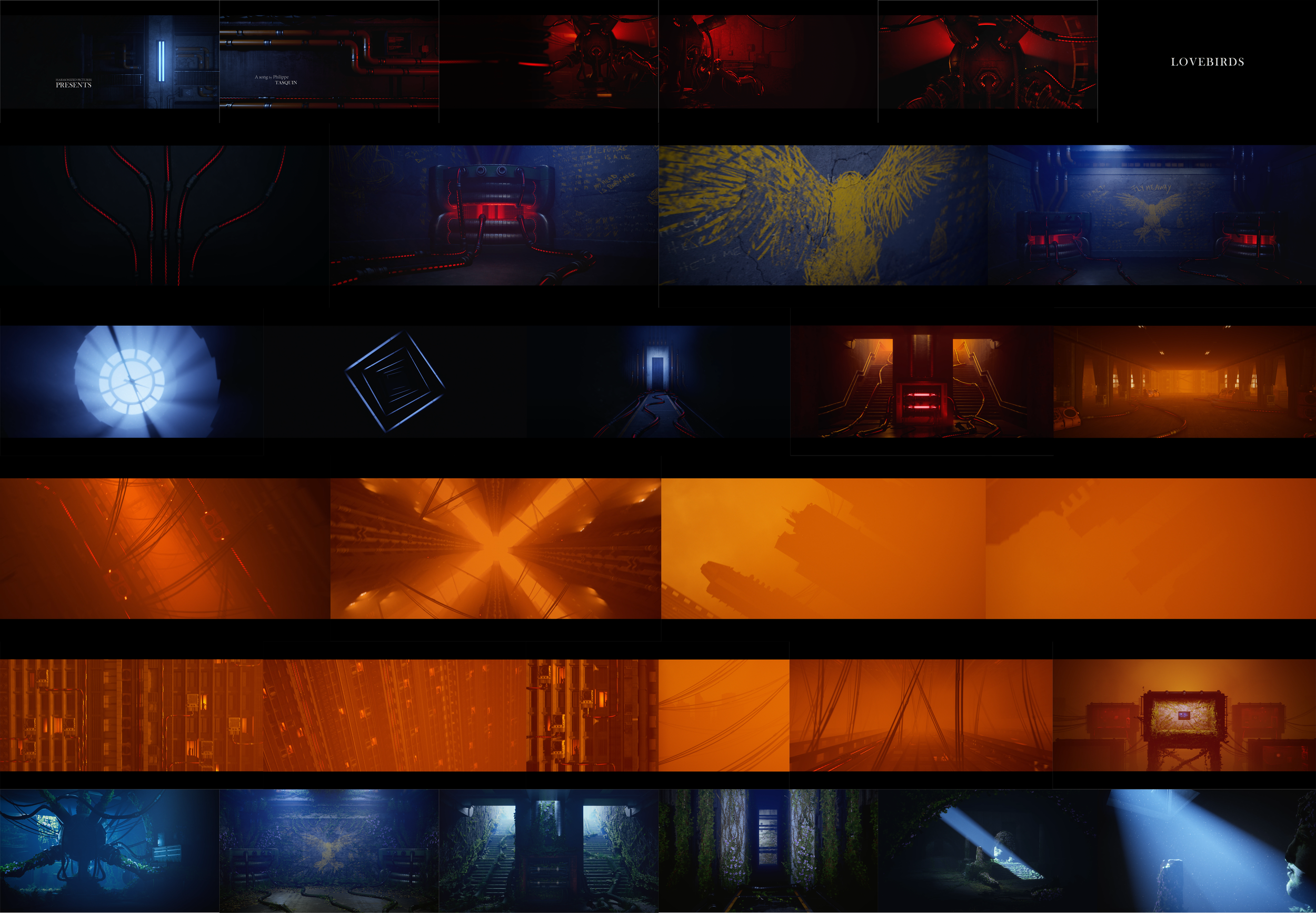
The song is divided in six parts, six unique visual chapters.
0. TITLES
1. APART
2. TIME
3. FREE
4. HOPE
5. VISION
THE MACHINE
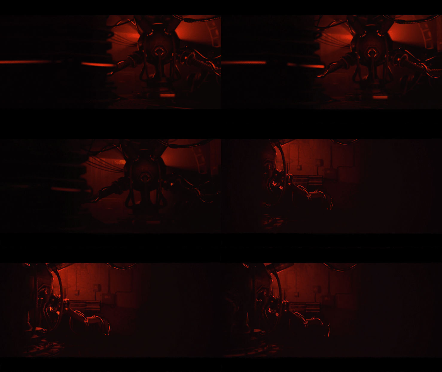
Controlling everything through its cables, the Machine represents the evil core of our society. Its influence, showing the hopeless situation of the main character, is represented by the red color in several shots.
THE CELL
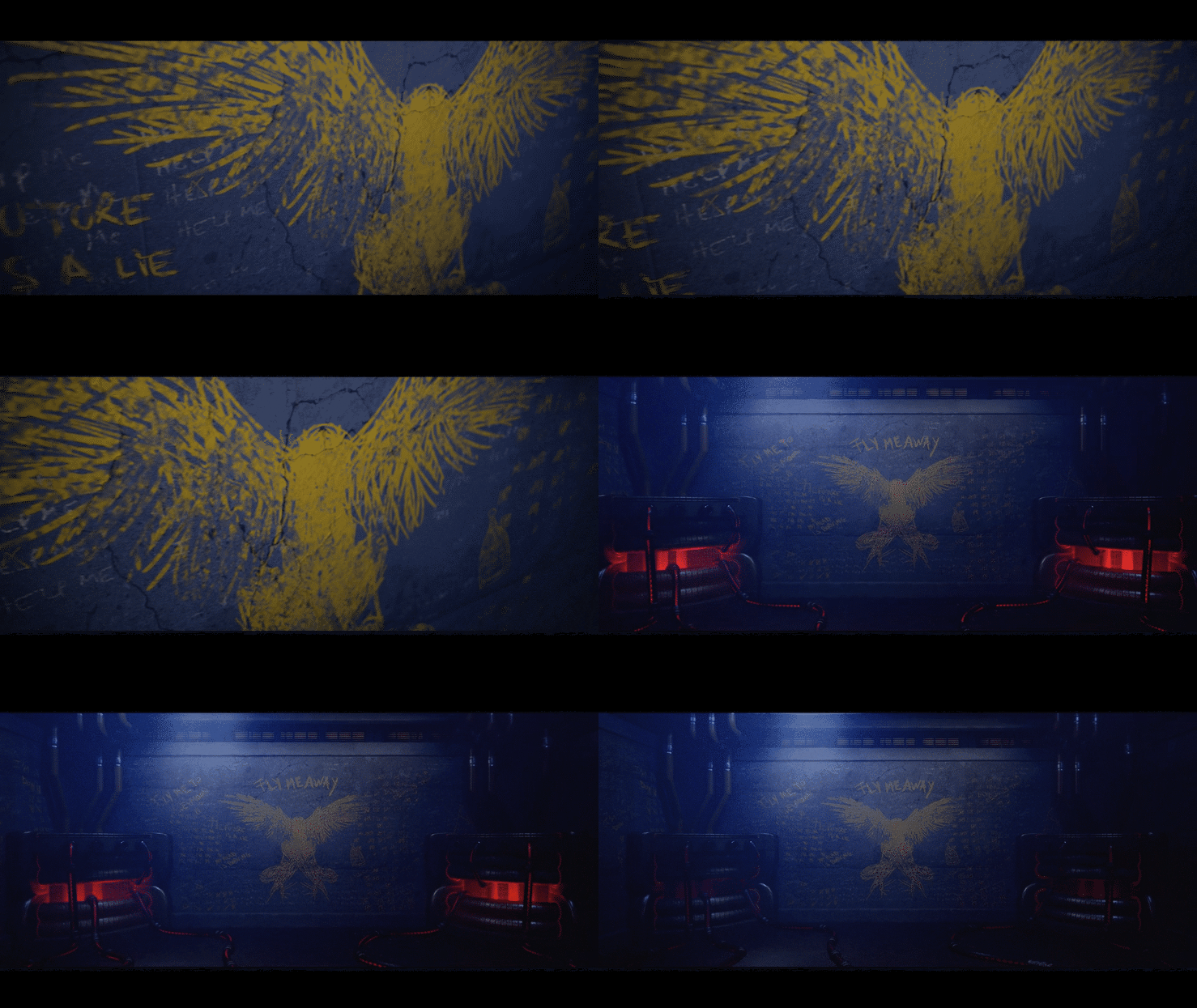
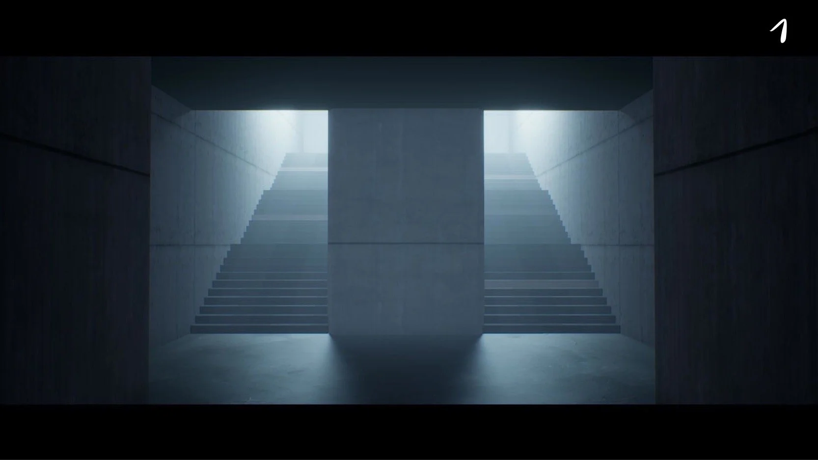
The first chapter takes place in a Brutalist structure which depicts the cold and hard reality of isolation.
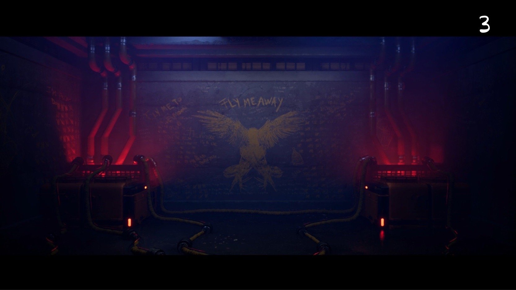
This shot showcases the cell in which the character spent countless days. It features relays for the machine and a lot of chalk drawings that show us the mental health of the prisoner.
TIME
Time is a recurrent theme in Lovebirds that I wanted to showcase through abstract circular patterns. The idea behind the clock shot was to make this abstraction part of the Brutalist facility in which the character is captive.
THE CITY
The city part was really essential to the shortfilm as it extends the prison of the protagonist to everyone. The color scheme completely changes, the camera movements are smooth and you travel great distances. You are finally free of the prison and fly away like a bird.
Nonetheless, something is not quite right. You slowly realize you’re in another prison, a seamless city full of people trapped in their own cell, wired by the Machine.
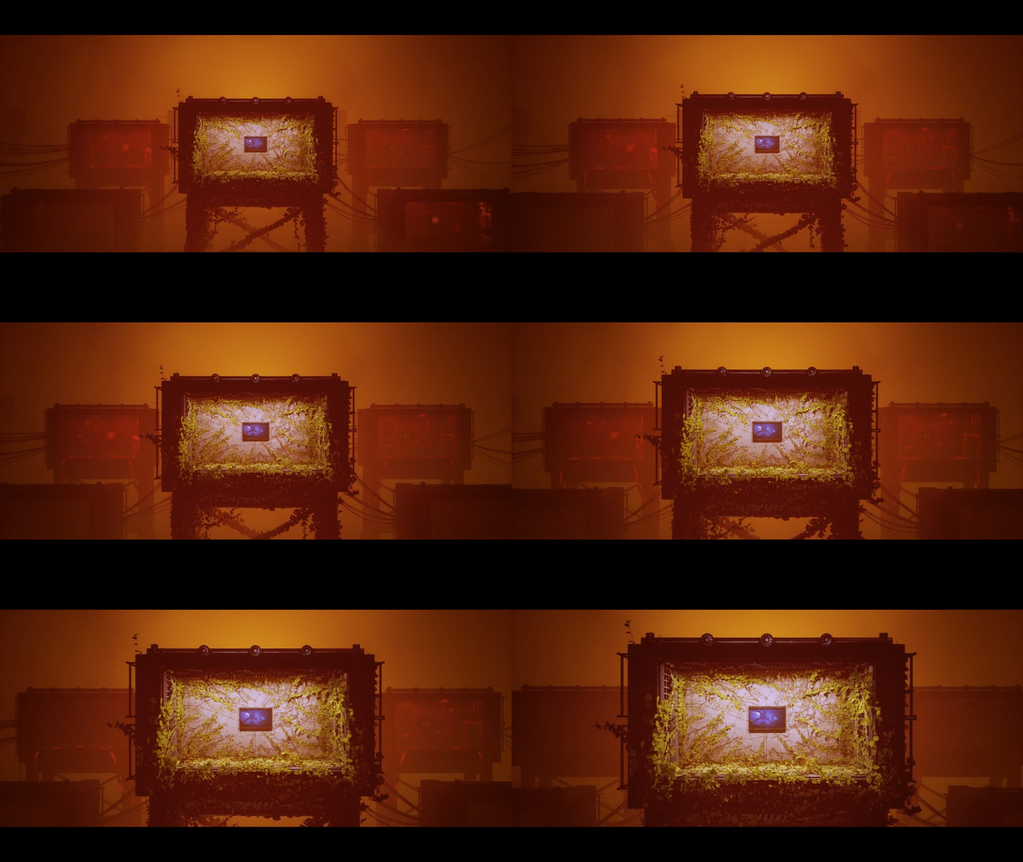
DREAM BOXES
This shot was a metaphorical transition between the city and the Hope chapter where the character is wondering if he’s dreaming as he sees white wings take him away. The vegetation is a symbol that takes all its sense in the next chapter.
The idea here was to represent the main character amongst others. He’s finally free from his pain but the others are still under the influence of the Machine.
HOPE
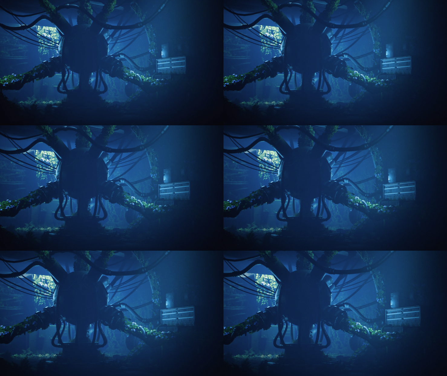
The hope chapter revisits the same places as before but everything has changed. The Machine is broken, vegetation has grown and the mood is completely different. We don’t know what’s real or not anymore.
This shot marks the transition from an aspect ratio of 2:40:1 to 1:85:1. What motivated this change was the feeling of freedom I wanted to convey. The spectator is not locked between 2 black bars anymore, the entire screen is used to display the whole picture.
marketing
Lovebirds was such meaningful to us that we wanted the project to be part of a whole. To do so, we produced a poster, visuals for social networks and a teaser with an exclusive soundtrack as we didn’t want to reveal too much of the song.
We decided to release the project on march 12th, the one year anniversary of the lock-down in Belgium.
To do things right, we created Harmonized Pictures, a fictive company that embodies our collaboration. My father’s making music, I’m making visuals and every project features a title sequence with sound design.
THE TEASER
THE POSTER
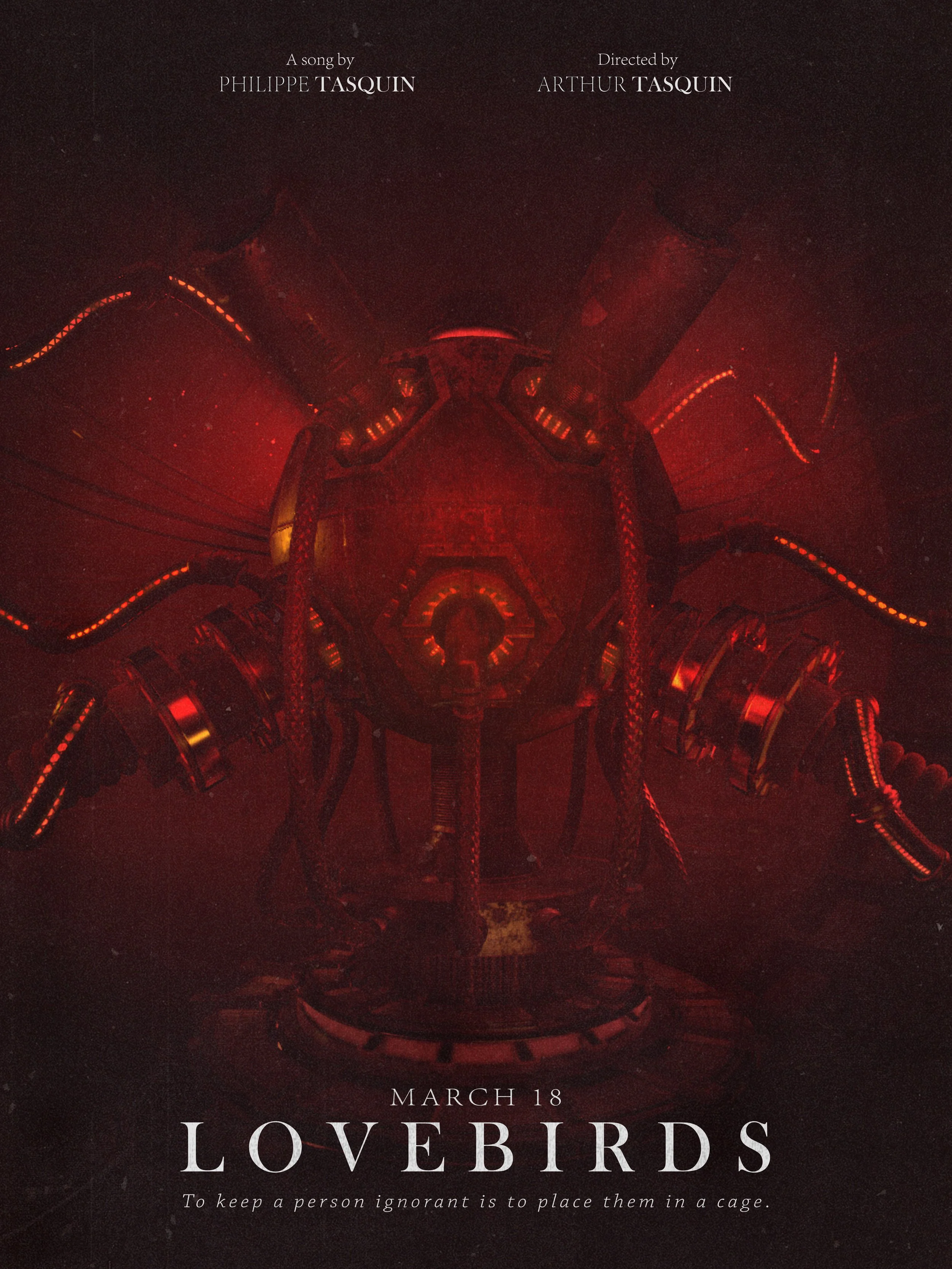
The idea behind the poster was to contrast the lovely title with the horrific visual. As we didn’t plan to print it, I wanted to make the visual dirty as if it had been displayed for a long time in the street.
VARIANTS
VISUALS
BEHIND THE SCENE
Lovebirds took about nine months to complete. Here’s a glimpse into my creative process.
MOODBOARD
When the idea of Lovebirds came to my mind, I was playing Control, a game by Remedy where the player finds himself trapped in a secret Brutalist skyscraper in the middle of New York. The visuals of this game resonated so much with me and the theme of our project that I spent countless hours just wandering in the environment and taking screenshots.
The second most obvious reference is Blade Runner 2049 from which I took the color palette of the abandoned city part.
As a big fan of Ash Thorp, I started to review his work on Awaken Akira and None which are visual masterpieces to me.
IDEAS
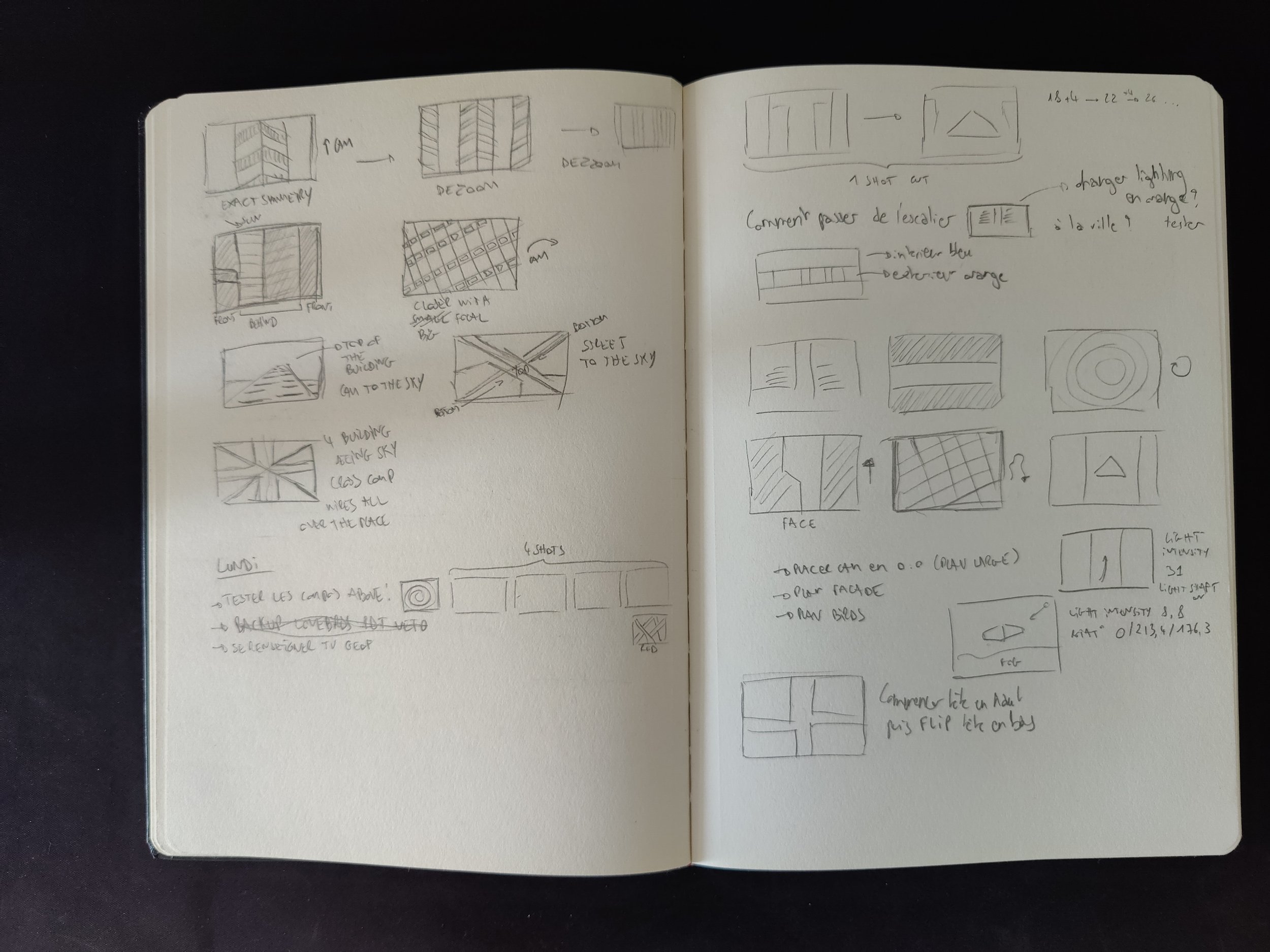
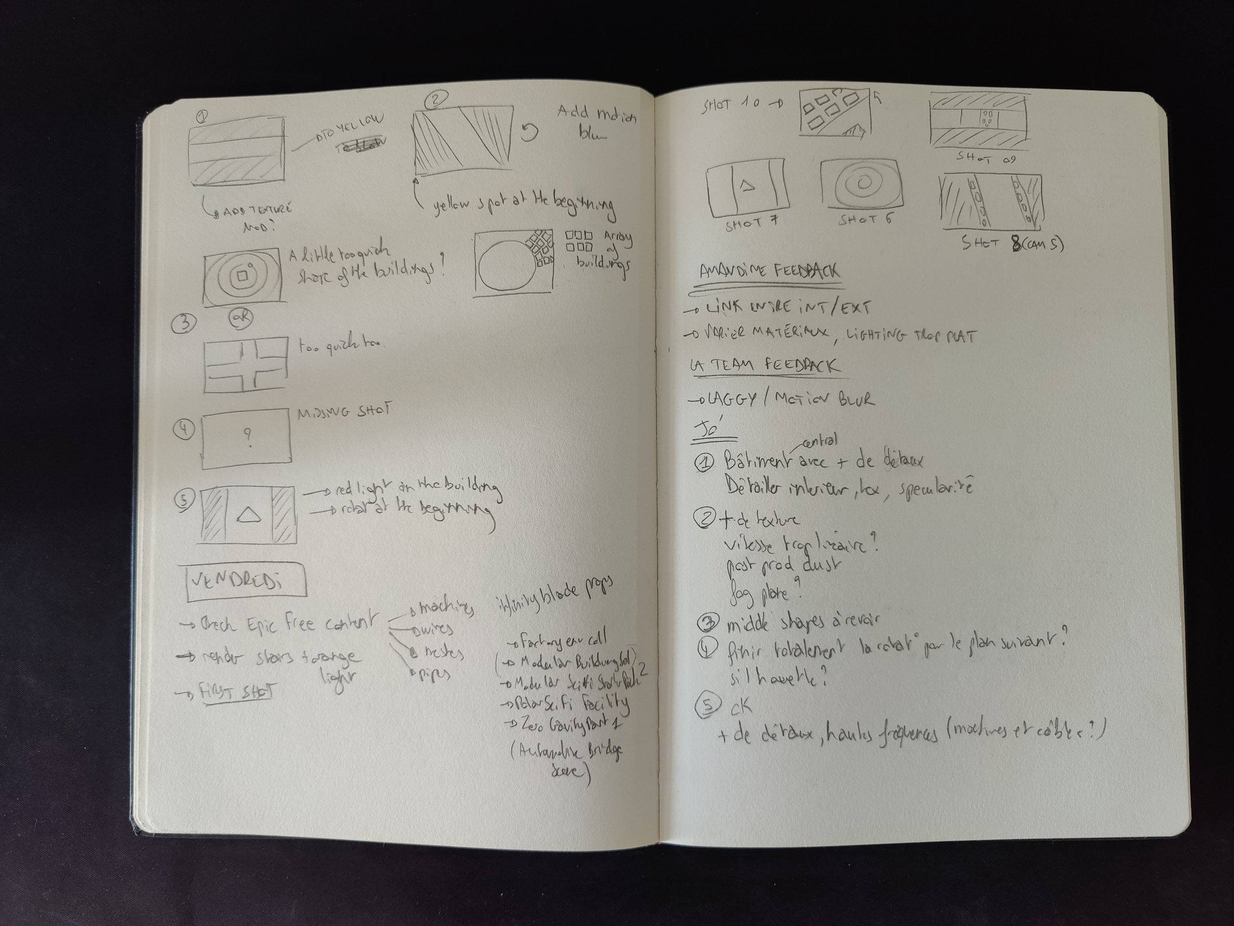
Every new project needs its own brainstorming of ideas and I found that for me, what works the best is to keep a notebook of the project full of notes and (bad) drawings. This allows me to revisit my thoughts every time I need perspective.
The second phase is to map all these ideas onto a digital mind map. This ensures that I keep a good vision of the whole project and helps me generate new ideas.
STORYBOARD
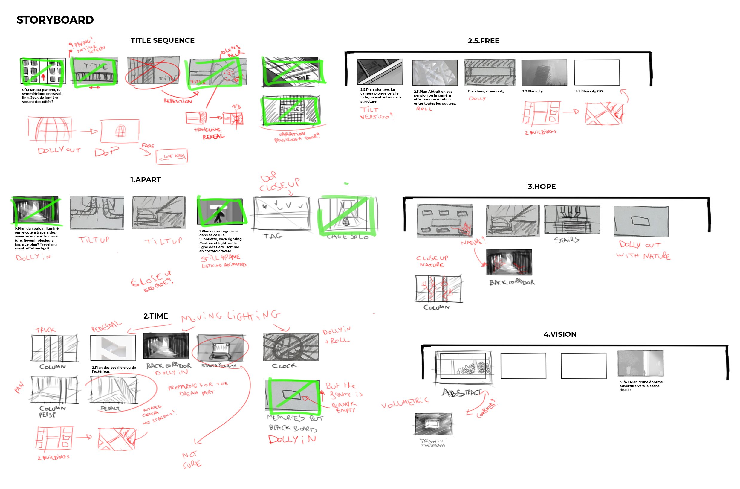
The storyboard, divided in 6 parts, was revisited multiple times to fit the vision we both had. We didn’t want to be too literal about the lyrics but we still needed some structure to evoke specific emotions at the right time.
TITLE DESIGN
As a big fan of title sequences, I wanted to make one myself in this project. I found the typographic design fascinating and I had a blast trying to shape my ideas into the choice of fonts, the placement of titles and composition of the visuals. I believe that the more thoughts you put in your craft, the more meaningful it becomes.
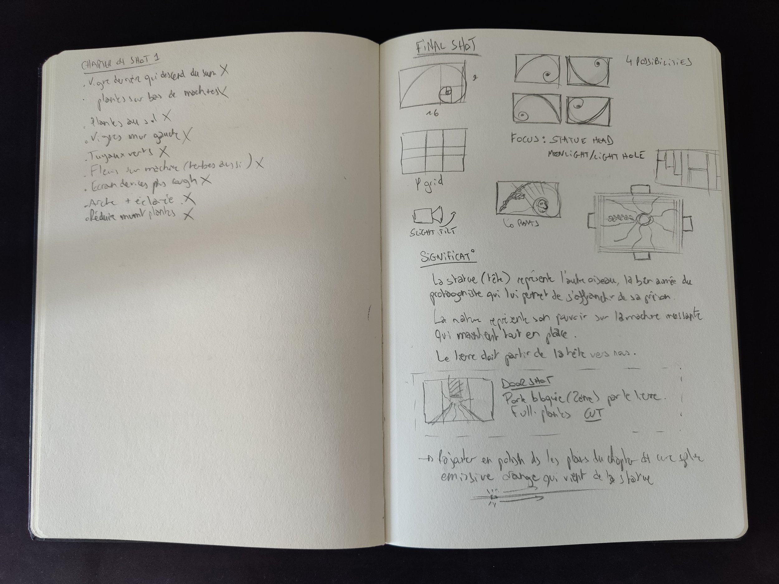
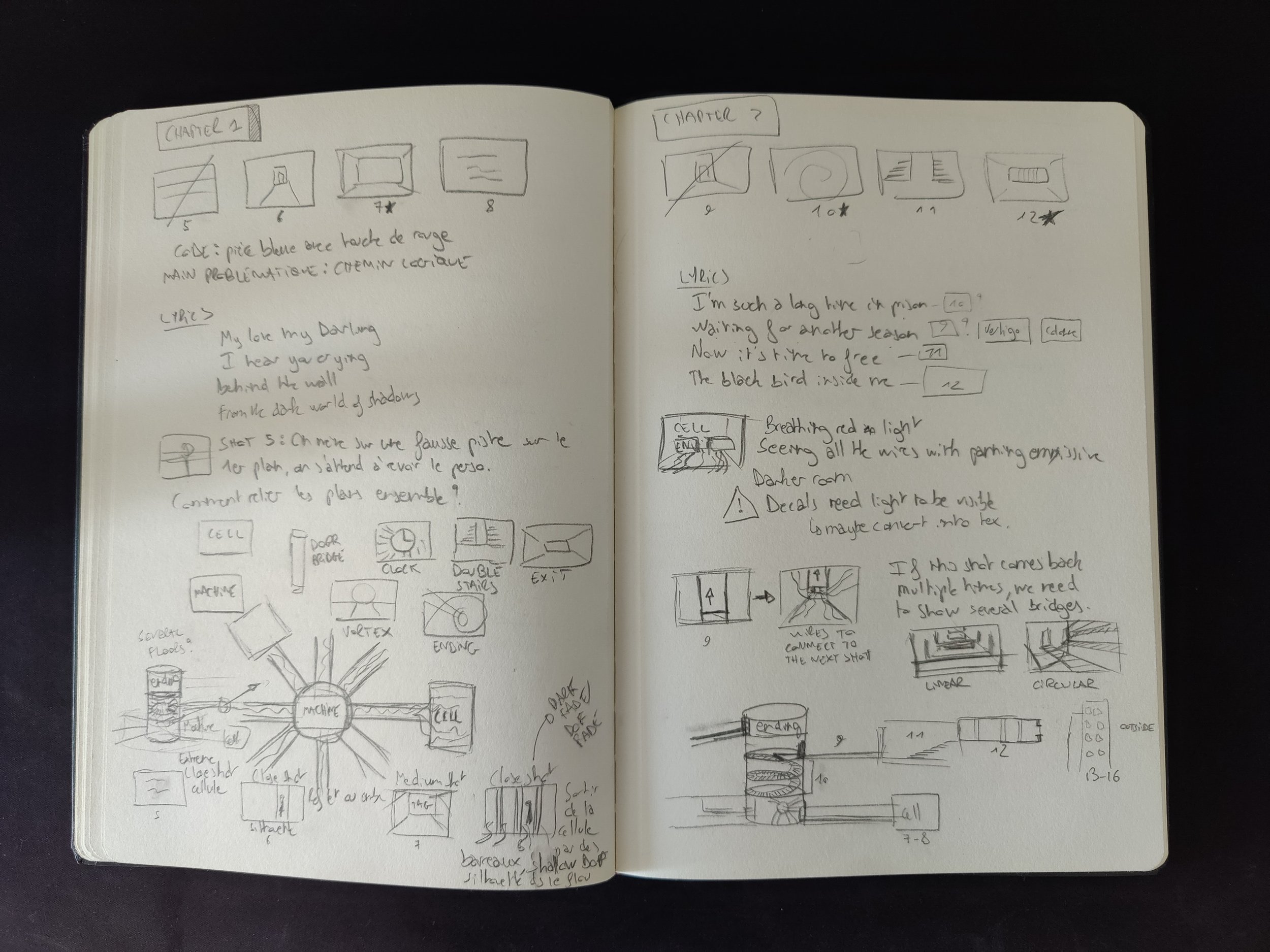
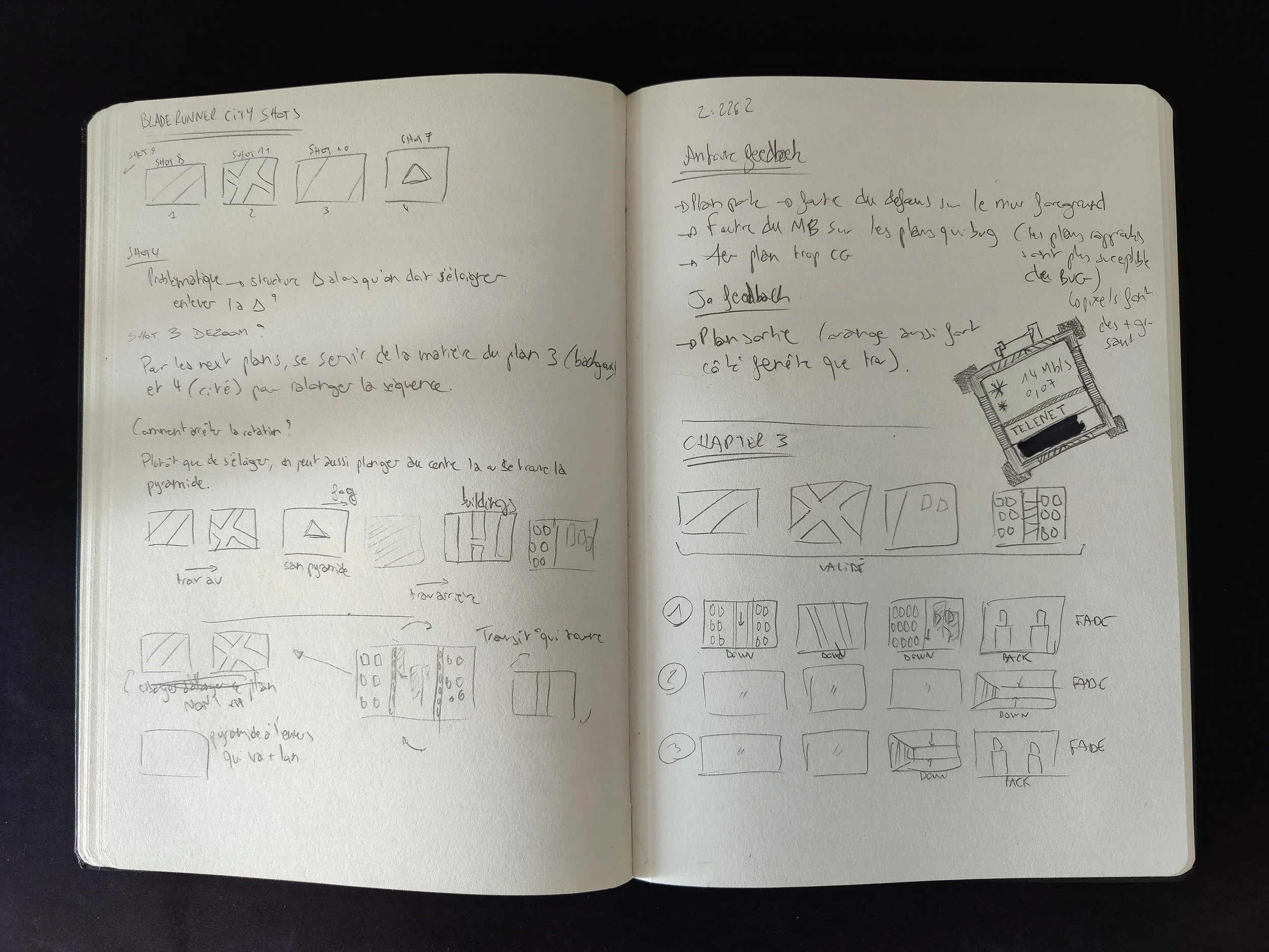
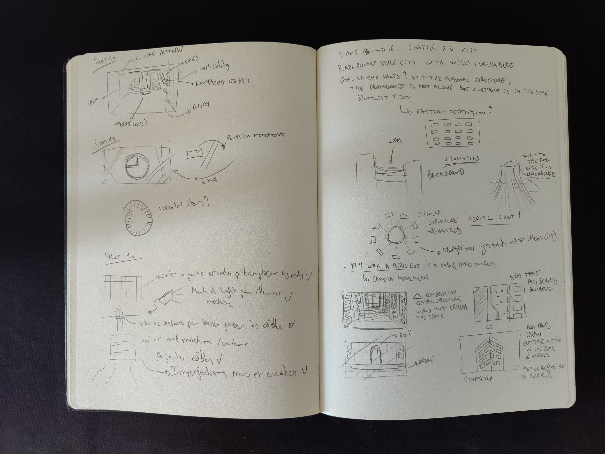
PROcESS
Symmetrical concrete staircase with minimal lighting
Futuristic underground setting with symmetrical staircases and a glowing red machine in the center, surrounded by dark walls and cables.
Futuristic staircase with glowing red neon lights, cables extending up the stairs, and a central structure in a dimly lit environment.
Abandoned stairway in an overgrown building, featuring ivy-covered walls and steps, with pipes and vegetation.

Dark and mysterious hallway with a concrete path leading to a doorway, surrounded by fog.

Dark, narrow hallway with tall walls and an open doorway at the end, in a minimalistic architectural style.

Dark, industrial hallway with pipes and cables leading to a closed door, lit dimly in the center.

Dark corridor with red cables leading to a closed door, dimly lit environment.



CUT FRAMES
A lot of work didn’t make it to the final edit, here are the cut frames I like the most.
post mortem
Interview in L’asymptomatique
Featured in the Unreal community spotlight
Selected for the 2021 national VKRS festival
INFOS
CREDITS
DESIGN: Arthur Tasquin
MUSIC: Philippe Tasquin
YEAR
2021
