
CHAPTER 2 - PART 1: DEEP SPACES
This blog post is part of a series that dives into visual structure. The last article was about the 7 visual components. If you want to see what’s coming after this one, look at the end of the page.
💬 Introduction
Hi there, my name is Arthur Tasquin and I'm a realtime artist working in the VFX industry. This is the chapter 2 of a series of articles called The Visual Journey. In these articles I talk about visual theory and how we can dissect it to use it in our own work. The goal for me is to document my learning process regarding visual structure, to experiment and share as much as possible. Although I quote well known and serious sources, which you'll find at the end of each blog post, what I say here must not be taken as an exhaustive list and a one and only way to apply visual structure to your work. This is only a path amongst the grande scheme of visual theories and you should not take it for granted as art is not something you can completely theorize (fortunately). It should only help you find your own path, expand your current knowledge or maybe be the beginning of a wonderful journey.
The structure of these articles is based on a book of Bruce Block called Visual Story which I talked a lot about in my first blog post.
Today I'll dive into space. Not the empty void that makes up 80% of our universe (though it would be very interesting) but the visual space that lies in every picture you could imagine, from the paintings of Picasso to the last banger of Naughty dog. Space is pretty important as it defines the place where you'll be able to play with the 6 other components that make up visual structure (line, shape, tone, color, movement, rhythm).
🛰️ TYPE OF SPACEs
As I mentioned it in the first chapter of The Visual Journey, there are four main types of space: deep, flat, limited & ambiguous. While depth cues define deep spaces and flat cues define flat spaces, limited and ambiguous spaces are a little bit different. Limited spaces are a combination of flat and deep and ambiguous spaces are unusual and rare spaces that lack cues. As this topic is really extensive, each type of space will have its own dedicated article. For today, I’ll only talk about deep spaces.
That being said, we can begin. So here’s the chapter 2 - part 1 of The Visual Journey.
🔗 TABLE OF CONTENT
🛣️ deep spaces
🎲 depth
Some cinematographer associates depth with the separation of the frame in several layers. Isolate the subject from the rest is a matter of depth. Though this view shares many similarities with what I'll talk about here, this is not exactly the same approach and we’ll get on this more practical stuff at the end of this section. As Bruce Block did, I want to describe what makes an image look deep to the human eye, list the visual inherent characteristics that define depth to our brain.
Deep space is the type of space that highlights depth and makes the visual appear three-dimensional. It is enhanced by depth cues. The main ones being: Convergence, Size Change, Textural Diffusion, Movements, Tonal & Color Separation.
🔼 Convergence
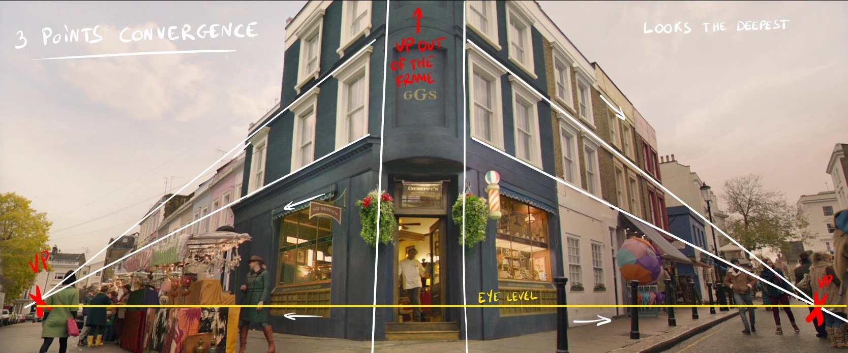
Convergence is the most important depth cues as it creates the best illusion of depth. This is actually the first thing you learn when you study perspective.
It can be applied to any element of the frame (objects, actors, places)* and creates longitudinal planes and vanishing points (VP). The number of these VP defines the type of convergence and the degree of depth; the more vanishing points, the deeper it'll look. Nonetheless, the audience generally won't notice more than 3 VP.
To get a better sense of those concepts, I recommend watching the following videos from Dan Beardshaw:


Arrival - Denis Villeneuve
What's interesting to note is that the edge of the longitudinal planes are often used as guiding lines to lead the eye of the viewer to the VP. It’s in your hands then to choose to put your subject on a VP but bare in mind that if you don't plan it carefully, they can steal the focus of your shot.
Furthermore, VPs that are out of the frame don't participate to the illusion of depth. That's why wider lenses appear to add more depth: because they expose more VPs to the frame.
How to add depth to your shot using Convergence cue ?
Use a wider lenses.
Change the angle of your cam.
Convergence in organic environments can be hard to perceive. Therefore you may want to introduce at least some straigth man-made elements in the frame.
*From now on, when I talk about element or object, it means any visual element that compose the frame, moving or not, living or not, an object, an actor, a part of the set,etc...
🧑🏽🤝🧑🏻 Size Change
Size change is based on the common assumption that objects appear smaller when they get away from us and vice versa. It is used by staging in depth “known size objects”. In other words, if the viewer knows the size of a specific element in the frame, you can place it at several distance from the camera to create depth. The most common use of size change is the staging in depth of actors themselves in the FG, MG and BG*.
Inside by Playdead
Dune - Denis Villeneuve
In Superliminal by Pillow Castle, the size change depth cue is used as a gameplay mechanic to grow or shrink objects.
The Tree of Life - Terrence Malick
Another factor that contributes to the illusion of depth is the distance from the horizon.
Basically:
when an element is close to the horizon, it will seem farther away.
when an element is far from the horizon, it will seem closer.
How to add depth to your shot using Size Change cue ?
Add known size objects into your shot and place them in different depth layers.
Make the horizon line visible.
Scatter elements from both sides of the horizon.
*Respectively: Foreground, Midground and Background
☁️ Textural Diffusion
Textural Diffusion is defined by the loss of detail & texture in depth. The more detailed an element is, the closest i'll look to the camera.
Shining - Stanley Kubrick
One Flew Over the Cuckoo's Nest - Miloš Forman
This depth cue is really complicated to control in a production as it happens naturally, our eyes can’t perceive the details of a distant object. Nonetheless, it is possible to shoot deliberately in a set* lacking detail and texture which will make the visual flat.
Alien : Covenant - Ridley Scott
Another factor that enhances depth is aerial diffusion which is defined by the density of particles in the air. Fog or smoke are well-known aerial diffusion examples but you get the effect too with rain, snow, dust, smog or any other particles in the air blocking the light rays.
This physical phenomenon causes the details to fade sooner that they would be normally creating an illusion of deeper space.
No Time To Die - Cary Joji Fukunaga
However, aerial diffusion also implies tonal & color compression which can make the visual look flat if the effect is too strong.
Blade Runner 2049 - Denis Villeneuve
How to add depth to your shot using Textural Diffusion cue ?
Use recognizable pattern through depth.
Shoot when the weather is suitable for a deeper effect (foggy morning, snowy day, etc…)
Fill your set with atmospherics by using aerosol spray or specific devices to create fake smoke.
*When using the word “set” in this article, I’m referring obviously to the actual space where the action takes place in a real life film production but this can be transferred to our digital domain too. From now on, “set” means physically or digitally space/environment where we frame our subject.
🏃♂️ Movements
The movement cue can play a big role in making your shot deep. There are two types of movements that create the illusion of depth: object movements & camera movements.
🚗 Object Movements
Generally, an object only creates depth when it moves perpendicular to the picture plane*. Nonetheless, there's an exception if your introduce relative movement (see The Visual Journey: Chapter 1) to the equation: when several elements are staged in depth and moving at different speed parallel to the picture plane.
Mad Max: Fury Road - George Miller
Something interesting to notice is that when an object is getting close to the camera, it seems to speed up and vice-versa.
Pirates of the Caribbean : Dead Man's Chest - Gore Verbinski
🎥 Camera Movements
Three camera movements** can create relative movement and therefore give depth to your shot:
Dolly IN & OUT
Track LEFT & RIGHT
Crane UP & DOWN
By only affecting the position of your camera, you introduce what is called the parallax effect which will offset the elements of your frame based on their distance from the camera.
This effect is a handy tool for astronomers to calculate the distance of stars and it’s also extensively used in Virtual Production. If you want to go further into this subject, CoPilot made a quick and easy to understand video.
For these camera movements to be effective, you need a certain distance in depth between the elements of your frame. Usually, having a really close object in the frame creates a better parallax effect, especially indoors where the distances are small.
How to add depth to your shot using Movements cue ?
Make a moving shot.
Introduce object movements that are perpendicular to the picture plane .
Use Dolly, Track or Crane to add parallax effect.
Make sure you have enough space in depth or a close element to get an effective parallax effect.
*To quote Bruce Block: the picture plane is the two-dimensional window that frames our pictures. It is what we see through the lens of the camera.
**The names used to define the three camera movements don't have anything to do with gears here.
🔳 Tonal & Color Separation
Here are two minor depth cues based on human visual perception of colors and tones. The theory says:
The tonal separation is defined by the contrast of brightness in the frame. Generally speaking, bright elements will look closer and dark elements will look farther away.
The color separation is defined by the contrast of color temperature in the frame. Generally speaking, warm colors will look closer and cool colors will look farther away.


Personnally, I’m not fully convinced as I don’t really perceive the depth difference between bright & dark or warm & cold. Nonetheless, what’s clear to me is that the less tones or colors you use, the flatter your visual will look. By using white, black and every tones in between, you increase the range of tones you use and the same applies to the colors.
Small Tonal Range - Prisoners - Denis Villeneuve
Big Tonal Range - The Water Diviner - Russell Crowe
Warm & Cool - The Place Beyond The Pine - Derek Cianfrance
Monochromatic - Vertigo - Alfred Hitchcock
How to add depth to your shot using Tonal & Color separation cues ?
Use a bigger range of tones by art direction or lighting.
Use a bigger range of colors (both warm and cool).
⏸️ Depth Layers and subject separation
As stated in the introduction of this section, the division of depth into several layers can make the space feel deep. As a picture maker, you should particularly think about how to isolate the subject of the frame from the other layers. This section is a collection of guidelines for this layer division and additional advices to help you create deeper spaces.
Focus
Depth of field is a tricky component as it can both help you get you where you want or completely harm the sense of depth in your shot. It can be a wonderful tool to isolate your subject from the rest of the frame by using a shallow depth of field and put the focus of your cam on the subject.
Shallow Depth Of Field - Arrival by Denis Villeneuve
Nonetheless, this method also comes with a caveat: by blurring everything behind the subject, you lose the impact of others depth cues. Having a depth of field can elevate the realistic feel of your visual as it mimic how we focus with our own eyes.
House Of Lights - Personal Project
Furthermore, by shifting the focus with a rack focus* for instance, you guide the viewer through depth making the illusion of three-dimensionality very believable.
Lighting
Lighting is a key component to make your subject stand out. It can define the space and the spatial relationship of objects within your frame. The way lights and shadows work is completely integrated in our brains which makes it easier for us to perceive three-dimensionality when the lighting is clear (hard shadows, high contrast, bright lights). That’s why overcast lighting feels flat.
Fast and Furious: Hobbs and Shaw - David Leitch
In his book Three-Dimensional Imaging Techniques, Takanori Okoshi briefly talks about the physiology and psychology cues of depth perception. An example that illustrates perfectly the way our brain works is this simple drawing of a square.
Fig a looks more like a convex shape and fig b looks more like a concave shape. But why is it the case ?
Actually, this illusion takes its origin from the fact that most of the lighting we’re used to comes from above. We’re more often seeing shadows in the bottom part of objects.
Another way to enhance depth with lighting is by using specific setups. Rim lighting** for example, can highlights the contours of elements and cut them of the background.
Captain Fantastic - Matt Ross
Contrast
Contrast in every way makes elements separate from one another. We already talked about high contrast lighting which facilitate the depth perception but this applies also to way more components. Tones, colors, textures, lines, shapes, movements: every visual component can make the space feel deep if you contrast them through depth. By putting red props in the front, violet props in the mid and green props in the background, you create a 3 layers separation in depth, making the space deeper.
Euphoria - Season 01
Occlusion or Overlap
Occlusion is inevitable when you compose a frame, by stacking objects in depth, you automatically make them overlap each other which creates depth. Although very simple to grasp, this parameter can be very effective and useful when you place your actors in the scene and especially when those are distant from one another.
The Girl On The Train - Ribhu Dasgupta
*To quote StudioBinder “A rack focus is the filmmaking technique of changing the focus of the lens during a continuous shot… from one object in the frame to another.”
**A rim light is placed behind a subject that exposes the outline or rim of the subject with light.
❔ Why should you use deep space ?
Deep space feels more natural to our eyes because it mimics real life. In the end, the medium, format or canvas of our work will be in 2D but using depth blends our work into reality and gives the audience the feeling to see our work through a window.
Inherently, deep space creates more visual intensity than the other types of space because all its depth cues are based on contrast. (More about this under “Contrast & Affinity” section in the Chapter 1)
Space is not a component you can always control because it usually depends on where the action takes place. This is especially the case for film productions where the shooting occurs in a real set. The benefit of creating digital imagery is that you can arrange the space at your will pretty quickly but you’re still not completely free from the story’s location. Let’s take for instance a sequence happening in a very small underground bunker: the lack of space will make the depth cues not as effective which could lead you to choose another type of space.
Visual Stereotypes
What I call visual stereotypes are common characteristics associated with a particular visual component. As their name suggests, these are not to be taken too literally and should only give you a place to start. What matters is that you pick a visual component that matches your story’s point of view and that you set up your own rules defined in the exposition.
Visual stereotypes are also culturally and temporally dependent which makes them evolves through time and space.
Here’s a list of the main ones associated with deep space:
Complexity
Freedom
Endless
Intensity
Real
Three-dimensionality
Dynamic
🎥 SHOT STUDIES
We know now what are depth cues and how to play with them to create depth in our work but there are a million possible combinations.
How can we know what cue will elevate our work and how can we train our brain to detect them ?
For this, you need to get your hands dirty and analyze how famous filmmakers are using them. This is why shot studies have been part of my creative routine while writing this article. You’ll find beneath 9 shots from different directors and DOPs that I found interesting to analyze. If you want to do the exercise by yourself based on the theory above, I gathered all the shots I used here. To help you with the process, I made a list of questions I ask myself everytime I do these deep space shot studies.
Each shot below is annotated to highlight informations about depth and space. If you want to hide the annotations, just click on the image.


This is a one point convergence shot where everything is pointed toward the actor. By using color contrast, guiding lines and framing, the DOP (director of photography) wants you to focus your attention on Brad Pitt. This is a pretty small interior but the Convergence and Size Change depth cues are used extensively which makes the space feel deep.


This one point convergence and open space shot use several cues to its advantage to guide your eye to the subject of the frame: The Imperial Court (dressed in white). Notice how Contrast (clothing), Textural Diffusion, Size Change and patterns are used to keep your attention on the center of the frame. The depth of the shot would not be as effective without the guards dressed in black and the carpet.


The film was shooted with a 8-64mm lens which allowed them to get wide shots as this one. Even though the subject is not exactly on the VP, making it wide allowed the guiding line to be stronger and helped bring the focus to the right of the frame. On top of the Convergence, the repetition of the cereal boxes and the patterns losing textures in the depth make this space deep.


The Convergence is something really hard to perceive in an organic space. To be able to find the VPs, you need two converging lines and the eye level. Here: the road is curved, nothing is aligned and there are almost no man-made element in the frame. Even if there are VPs in the frame, there’re not as effective because we can’t easily see them. Nonetheless, this shot doesn’t look that flat and this is surely due to the Size Change cue that makes the road looks thinner in the background, the slight aerial diffusion in the background and the global contrast.


In this example, the VP could steal the focus as it is far from the subject. Our eyes are drawn to the back of the space but it’s not where the action takes place. This hightlights the fact that everything is not always controlled and unalterable. Nonetheless, an isolated shot doesn’t tell the whole story. In Blade Runner 2049, we get several shots of the subject before coming to this one which helps us understand what we’re supposed to look at. Additionnally, we already saw this place in a previous scene from the other side of the room. Having the VP on this part of the set could help us figure out we’ve been here before.


Here’s the perfect example of how depth cues can elevate the depth of an indoor set. It shows why Convergence and Size Change are unavoidable if you want to create tri-dimensionality in your frame.


Sometimes, the subject of the frame is not on the VP and it’s intentional. We can feel in this shot the contrast between the actor and the building. The mood is quite explicit: on one side of the image the actor is in the dark in a cold empty parking lot and on the other side we have the VP on the building with warm lighting. This technique is often used to showcase the current mental state of the character.


This example showcases the use of atmospherics indoors making the space deeper by fading texture and details. The backlighting creates contrast through silhouettes which reveals the characters and makes them stand from one another. Size Change is then very effective but the Convergence is a little lost in the dark and grungy look of the frame (blurred vignetting).


Here’s the perfect example of wide but not deep. We have a completely open space without Convergence and Size Change. We could argue that the wheat is changing its size in depth but in my opinion the uniformity of the ground is too strong for that. However a few things contributes to the depth of the shot like the aerial diffusion of the mountains, the Textural Diffusion or the position of elements in relation to the horizon.
🎨 OTHER MEDIA
Movies are only one form of visual art and I believe it’s mandatory for our growth to explore the others.
photographY
This photo was taken by Sean Tucker, one of my favorite photographer. When you look at his work, the vast majority of his street photography is in black & white and features high contrast and flat spaces. However, in this piece, Sean used Convergence to point the eye of the viewer to the center of the frame making the space a little deeper than usual.
PAINTING
Painting is always a great medium to analyze because it shows you were it all comes from. However, it might not be the best place to start. As rules of perspective were discovered through the centuries, you often find yourself with “errors” in the visual, making it very hard to learn the basics. Sometimes though, it is deliberate and rules are bended to illustrate an unrealistic world. This is the case for the Perspective Box by Pieter Janssens Elinga which features at the same time a one point Convergence and a two points Convergence painted over a cubic structure.
Some painting like Der Wanderer über dem Nebelmeer by Caspar David Friedrich and a lot of landscape ones don’t rely as much on Convergence. You can see below that atmospheric effects are used extensively for Textural Diffusion but also to create contrast and dividing the space into several layers.
ANIMATION & DRAWING
Like paintings, drawings can feature perspective errors which makes it a little bit more complicated to study visuals.
However, I find it very interesting to dive into precise manual work like Tekkon Kinkreet. This anime takes place in a huge city full of alleys, detailed props and buildings. The exceptional skills of the concept artists working on this production allowed them to emulate the perspective distortion of certain type of lenses (fish-eye).
Tekkon Kinkreet - Michael Arias
Tekkon Kinkreet - Michael Arias
VIDEO GAMES
COMPOSITION
Composition in video games is not something easy to achieve as the visual is changing based on the player’s inputs. Most of the time it is affected by the type of camera used in the game (first person, third person, top-down, side scroller) and the type of game (2D, 3D, 2.5D, isometric). The rules are the same but the way to implement them is completely different. Level design, landmarks, points of interest, lighting, contrast, observation posts, layering: there are a lot of terms and techniques that deserve a specific blog post.
Tell me if you would be interested in that kind of content.
DEEP SPACES IN 3D GAMES
As stated before, Deep Spaces are a great way to make your visuals more believable and realistic to the human eyes because it mimics real life. When we talk about 3D video games, the effect of depth is even more present because the player is engaged in the content. By his interaction, he can control the camera/character and litteraly scout the place to get a better sense of the depth. In fact, I believe that it is almost impossible to create flat spaces in 3D games if the viewer is in complete control of the camera. However, you can still play with the depth cues to vary the degree of depth. The movement cue is of course replaced by the player’s input but the rest of the theory is still usable.
Some games like Superliminal (see Size Change Chapter) even use depth cues as a gameplay mechanic to affect the sense of depth.
THE LAST OF US PART 2
I could talk all day long about The Last Of Us Part 2 as this game affected me in so many ways. One thing that the team at Naughty Dog really nailed was to make an incredibly immersive and believable world. I can still see myself reading all the notes scattered through the Seattle chapter to get a better sense of the world in which I was evolving. I remember saying to myself: “This city is huge !”. The environment felt really deep and I can’t stop wondering if depth cues are not the reasons why.

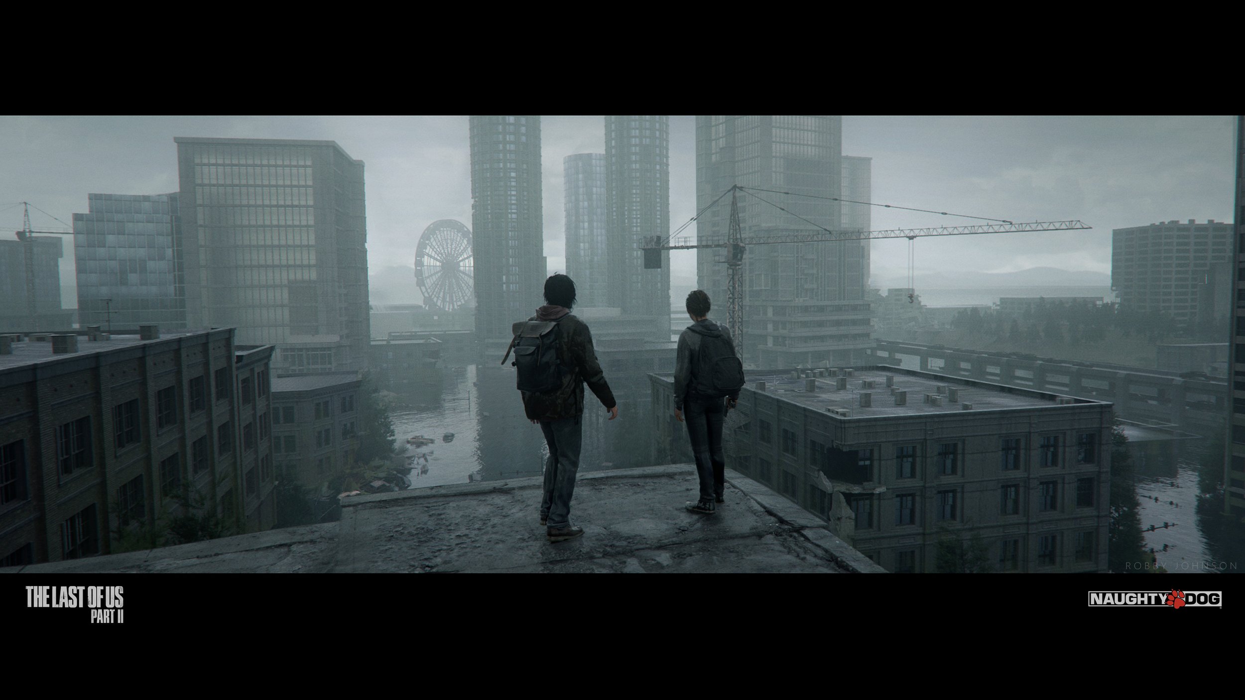
The environment in which the Seattle chapter takes place is a big city that conveys a great sense of depth.
Convergence: strong leading lines due to the city buildings.
Size Change: windows of the buildings, scattering assets through depth (cars, street lights).
Textural Diffusion: vegetation adds a lot of details fading in the depth, use of atmospheric effects.
Object Movements: ennemies coming at you to kill you create perpendicular movements.
Sunny lighting is creating contrast and a high range of tones.
Occlusion happens a lot in a city full of props.
Now that we saw several examples both in movies and other media, we can dive into the use of space throughout an entire production. Additionnaly to single shot studies, it’s important to put it into context and understand how space evolves from one scene to another. Hereafter, you’ll find two extensive studies on the use of space in The Shining and Control.
🚪 KUBRICK & DEEP SPACES
One point Convergence
Kubrick is known for his love for one point perspective (or convergence) compositions. As we saw it in the shot studies, it is the easiest convergence setup to create but it’s very effective and it works great with symmetrical visuals. Here’s a video that showcases the extensive use of this technique in Kubrick’s movies.
The Shining
⚠️ SPOILER ALERT: this part contains spoilers about The Shining.
In the first chapter of The Visual Journey, I talked about the concept of Contrast & Affinity and how the visual components you choose should always support the story.
Contrast of visual components increases visual intensity and affinity decreases visual intensity.
Contrast & Affinity can help you convey a certain emotion at a certain time by comparing visual components.
The choice of components needs to be driven by the story. You first need to know what you want to say before picking one component over the others.
I also talked about how you can set your visual rules during the Exposition to help the viewer understand your point of view. A perfect case for study (that we already mentioned in the first chapter) is The Shining from Stanley Kubrick. To state my case, I’ll use what Bruce Block calls visual structure graphs and a sheet containing all the shots of the movie. Those tools can help you step back and get a bigger picture of any production. They are also invaluable to plan your own projects.
SHOTS SHEET & VISUAL STRUCTURE GRAPHS
A shots sheet is the gathering of all the shots from a movie. Lucky for me, Vashi Nedomansky has already done the hard work of making one for The Shining.
Visual structure graphs are diagrams that can help you visualize the variations of visual components through an entire production and contextualize those variations with the story intensity. A graph can take the shape of a constant, a progression (positive or negative) or used with Contrast & Affinity.
Aligning the story graph with any other graphs can help you see how the visual components support the story. When analyzing The Shining, you quickly realize that the film features a general progression. Hereafter, you will find 4 visual structures graphs highlighting the story conflict intensity, depth, colors and shapes used in the movie. Notice how only the first 3 graphs draw a progression through the story but each of them uses contrast to enhance visual intensity.
General progression and contrast for the 6th chapter.
Huge contrast between the 5th and 6th chapter.
Use of contrast from the 6th to the 8th chapter.
Almost a constant except for the 8th chapter.
VISUAL EXPOSITION
The visual exposition takes place during the Interview chapter. You learn about the Torrence family, the Overlook Hotel and its history, the power of Danny and the danger they expose themself to.
3 visual components seam to have a particular meaning in The Shining: the space, the color and the shape.
COLORS
The red has a particular meaning: it’s the color of blood and murder, the color of danger. To remind the viewer the importance of red, the color appears a lot throughout the film. In the visual exposition, the hue is mainly orange and brown but when Danny has its vision, the red takes all the place and it’s the combination of the story intensity and the visual component that makes us understand this specific visual rule (red = danger).
The intensity reaches its peak during the elevator scene.
The “redness“ follows the story intensity graph.


Additionnaly to the high intensity shots, we’re also used to red used through Art Direction on specific props. This is the case for Danny and Wendy’s clothes that are usually red. I believe, it’s a way to help us understand visually that they are the ones in danger.
SHAPES
The shapes are mainly squared and triangular except for one scene: the Room 237. This case illustrates perfectly the concept of contrast in the film and how you don’t need to change all the components for every conflict of the story.
Global intensity progression.
Peak during the wednesday chapter.


SPACE
Spaces are always deep but you still see a progression of depth throughout the film and a bigger depth when the conflict intensity is high.
Global intensity progression.
Global progression and high peak during twins (6) scene.
In some scenes like the twin one, contrast of space from shot to shot is used to enhance the visual intensity. Notice how jagged is the space graph compared to the story one.
The whole sequence is high intensity.
To create visual intensity => contrast from shot to shot.


It’s interesting to note that Kubrick’s use of deep spaces is unusual. As I mentionned it in the first section, depth is commonly associated with freedom: you expose the whole space to the viewer which creates room for the eyes to wander. In contradiction with visual stereotypes, depth in The Shining means captivity. It enhances the claustrophobic feeling you get when you’re trapped in a maze and the disturbing vibe coming from empty places supposed to be filled with people. The space seems to never end and there are no way out.
WEDNESDAY
Wednesday chapter is an interesting part to analyze for multiple reasons:
The use of color contrast from one scene (Jack at the bar) to another (Room 237).
The use of color affinity within a scene (Room 237 & The Red Restroom).
How breaking your visual rules can create visual intensity (Room 237).
How space elevates the tension by playing its own character.
The meaning of the red color.
Intensity peak during Room 237 scene.
Contrast during the whole chapter.
High peak during Room 237 scene.
High peak during the Red Restroom scene.
🚨 CONTROL
When I first played Control, I was captivated by the cinematography of the game. The team at Remedy had figured out how to bring cinematographic rules into a video game and how to adapt them. On top of the lighting, the mood or the fidelity of the 3D assets you encounter, there is something really special about the space in which the story takes place.
Control is a game of contrast. At its core, it features the conflict of two unmatching worlds: the mundane/the reality and the weird/the dream. You play Jesse Faden, the Bureau’s new director, and you’re trying to figure out what the heck happened in this huge Brutalist building owned by an occult version of the CIA.
As a big fan of David Lynch and dream logic, Sam Lake, creative director at Remedy, wanted to express his love for the “New Weird” genre into a video game. However, it came early in the development of Control that this had to be grounded in the present real world for the player to engage with the story. To quote the world design director Stuart Macdonald “You can’t have weird without a fundation of mundane”.
This duality between reality and dream is expressed through several layers:
The mundane is represented by the Bureau, a Brutalist huge structure in the middle of New York that depict the order and stability of a government facility.
The weird is reprented by the Hiss, a hostile paranatural force of resonance that took “control” over the FBC (Federal Bureau of Control).
THE MUNDANE
Brutalism is a style that emerged in the 1950s and grew out of the early-20th century modernist movement. Brutalist buildings are characterised by their massive, monolithic and ‘blocky’ appearance with a rigid geometric style and large-scale use of poured concrete.
The team had the chance to count on Macdonald’s architectural background and love of Brutalism to extract some guidelines for the design of the Bureau.
Those guidelines were:
Repetition
Symmetry
Surface details (boarded concrete)
Structure (waffle ceiling, beams & mass)
Depth

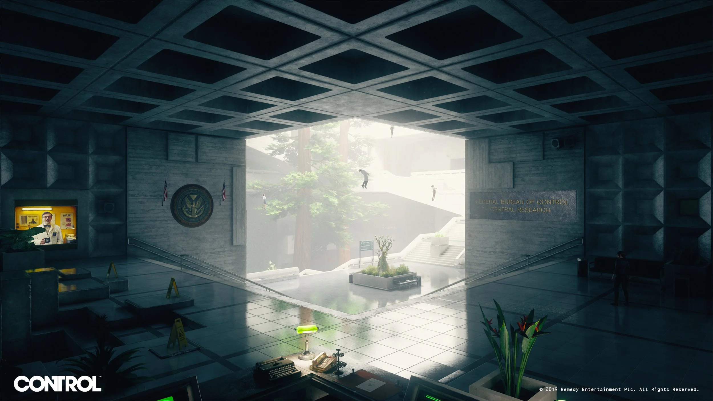

And this is where it gets interesting for us: through its properties, Brutalism makes it easier to create deep spaces.
The simplicity of its structure reveals guiding lines and strong Convergence.
The repetition and design highlights the Size Change cue.
The surface details add patterns which accentuate Textural Diffusion.
Additionnaly to the Brutalism, the team got inspired by the work of Stanley Kubrick and David Lynch, especially for their techniques to draw the eye of the viewer.
As Stuart Macdonald said: “The use of single-point perspective was something we really leaned on for this project.“ and it is striking when you enter new areas.
To re-inforce the composition, the camera sometimes shifts a little bit to put the player right in the middle of the screen and allow perfect symmetry.
THE WEIRD
The weird is represented by chaos and destruction.
Firstly it is embodied by the Hiss which takes control over the Bureau’s workers and altered items.
Secondly, it is represented by yourself: an outsider, Jesse Faden, who can use her power to interact with a completely destructible environment.
Thirdly, it is depicted by the living nature of the Bureau: the building shifts.
The Hiss
Destruction
Building Shifts
Those 3 points disrupt the simplicity, stability and order of the Brutalism by turning the space into a new chaotic version of itself.
🆓 GUIDES
One of my goals with these blog posts is to document the whole process and build tools to help you grow artistically. For this subject, I’ve made two guides:
The first one is a collection of tips and reminders on how to make deep space.
The second one is a roadmap for deep space studies.
CONCLUSION
Deep spaces and depth in visuals are all about making your world believable, they make the viewer wonder what’s outside the frame. Inherently, deep spaces create more visual intensity because all their depth cues are based on contrast.
Hereafter, you’ll find bullet points that sum up the whole article you just read.
THEORY
Space is pretty important as it defines the place where you'll be able to play with the 6 other components that make up visual structure.
Deep space is defined by depth cues.
The depth cues are: Convergence, Size Change, Textural Diffusion, Movement, Tonal & Color Separation.
Convergence is the most important depth cue defined by vanishing points (VP) and the eye level.
The number of VPs affect the degree of depth and VPs often draw the attention of the viewer.
Size Change is used by staging in depth known size objects (actors, chairs, houses).
Element’s distance from the horizon affects their depth perception.
Textural Diffusion is defined by the loss of details & texture in depth.
Aerial Diffusion enhances as long as the effect is not too strong (color & tone compression and blocking the visibility).
Only perpendicular object movements will create depth.
Dolly, Track and Crane are the only three cam movements creating parralax.
Bigger range of tones and colors makes the visual deep.
Another way to create depth in your visual is by isolating the subject from the rest of the frame. This can be achieved by playing with Depth Of Field, Contrast, Lighting or Occlusion.
STUDIES
One point convergence is more used due to the difficulty of capturing multiple VPs in the same frame.
Open & Organic spaces are usually less deep due to the difficulty to detect any Convergence.
Convergence is the most effective depth cue, Size Change comes just after.
Too many elements or details in the frame can be detrimental to the Convergence.
You can always break the rules.
Set dressing can drastically affect the depth of a shot.
Using Contrast and Convergence in parallel works like a charm to lead the eye of the viewer.
Sometimes, you may want to bend the rules to your advantage to create a beautiful piece of art.
The location where the story takes place matters.
Composition in video games is based on the same rules but its implementation is completely different.
As the player’s input impacts the camera movements, 3D video games are inherently deeper than other media.
Even if the player controls the camera, you still have other cues to play with.
Any visual component can be associated with any meaning, you just need to introduce your visual rules in the exposition.
Visual structure graphs and shots sheets are invaluable tools to analyze how visual components support the story.
You can’t control every components of a frame.
Every conflict doesn’t need contrast.
REFERENCES
All the shots used in this article are coming from Shotdeck.
INTRODUCTION
CAMERA MOVEMENTS
DEPTH LAYERS AND SUBJECT SEPARATION
SHOT STUDIES
CONTROL
⏭️ ROADMAP
Here’s the roadmap for the articles of the series.
The Visual Journey: Deep Spaces
The Visual Journey: Ambiguous & Limited Spaces
The Visual Journey: Surface Division
The Visual Journey: Aspect Ratio
The Visual Journey: Lines & Shapes Study
The Visual Journey: Tone Study
The Visual Journey: Movement Study
The Visual Journey: Rhythm Study
The Visual Journey: Color Study
And more....