
CHAPTER 2 - PART 2: FLAT SPACES
This blog post is part of a series that dives into visual structure. The last article was about deep spaces. If you want to see what’s coming after this one, look at the end of the page.
💬 Introduction
Hi there, my name is Arthur Tasquin and I'm a realtime artist working in the VFX industry. This is the chapter 2 of a series of articles called The Visual Journey. In these articles I talk about visual theory and how we can dissect it to use it in our own work. My goal is to experiment and document my learning process regarding visual structure. All the sources I used to develop this article can be found in the end. Though, I encourage you not to take them or this post as an exhaustive list or a one and only way to apply visual structure to your work. This is only a path amongst the grande scheme of visual theories and you should not take it for granted as art is not something you can completely theorize (fortunately). It should only help you expand your current knowledge or even become the beginning of a wonderful journey.
The structure of these articles is based on a book of Bruce Block called Visual Story which I talked a lot about in my first blog post.
🛰️ TYPE OF SPACEs
Space is pretty important as it defines the place where you'll be able to play with the 6 other components that make up visual structure (line, shape, tone, color, movement, rhythm). As I mentioned it in the first chapter of The Visual Journey, there are four main types of space: deep, flat, limited and ambiguous. While depth cues define deep spaces and flat cues define flat spaces, limited and ambiguous spaces are a little bit different. Limited spaces are a combination of flat and deep and ambiguous spaces are unusual and rare spaces that lack cues. As this topic is really extensive, each type of space will have its own dedicated article. The last one was about deep spaces. I recommend reading it first, as I will refer to it a lot in today’s topic: flat spaces.
That being said, we can begin.
🛣️ flat spaces
Flat space is the visual opposite of deep space. It emphasizes two-dimensionality and is defined by flat cues. The main ones being: Frontal Planes, Staging in 1 plane, Textural Diffusion, Movements, Tonal and Color Reduction and Reversing Depth Cues. Flat cues are basically the opposite of the depth cues I talked about in my previous blog post.
🚪 Frontal Planes
Frontal Planes cue is the exact opposite of Convergence. It is the most important flat cue as it creates the best illusion of two-dimensionality. It doesn't feature any longitudinal planes or vanishing point (VP) which means that the edges of the planes won't be as effective in guiding the viewer's eye. The effect of flatness is better achieved when having vertical and horizontal lines parallel to one another.
The Last Of Us - S01E01 - Craig Mazin
How to enhance flatness using Frontal Planes cue ?
Use a telephoto lens to capture less perspective.
Keep your camera angle perpendicular to the subject.
Hide the horizon line.
1️⃣ Staging in one plane
Staging elements of the frame in one plane in depth enhances the flatness of the shot by preventing size change cue. Placing well known size objects at the same distance from the camera and making sure the elements bases are aligned gets you size consistency and one plane staging. The most common elements staged in one place are actors themselves.
Empire Of The Sun - Steven Spielberg
Jojo Rabbit - Taika Waititi
How to enhance flatness using Staging in one place cue ?
Place elements at the same distance from the camera.
As we are drawn to human shapes, staging actors in one plane will have a stronger effect.
Avoid using the same props multiple time in depth.
☁️ Textural Diffusion
Textural Diffusion is working exactly the same way as with deep space. It is defined by the loss of detail and texture in depth. The more detailed an element is, the closest it'll look to the camera. To get a two-dimensional look, the frame should feature the same amount of details on every prop, from the foreground to the background. This is of course almost impossible in real life as this effect happens naturally. You can’t control the amount of details in the background because it’s a biological limit of our eyes. Nonetheless, you can still play with two things: the lack of details and aerial diffusion.
Alien : Covenant - Ridley Scott
By shooting a scene in a set* lacking details, you’re making sure that foreground and background share the same amount of visual information which will trick our brain to believe the space is flat.
Macbeth - Justin Kurzel
As stated in the deep space blog post, aerial diffusion is a great tool at our disposal to enhance the depth of our shot, mainly because we faced frequently this phenomenon at far distances and it’s now written in our brain. By making the density of the particles in the air high enough, you can hide the depth cues in the background and replace it by a unified detail-less frontal plane. You reduce the space. Aerial diffusion also tends to decrease the color and tone range which ultimately adds to the flatness of the shot.
How to enhance flatness using Textural Diffusion cue ?
Shoot in a detail-less set.
Reduce the number of textures and details from your shot.
If using aerial diffusion, make sure the density of the effect is high enough to hide depth cues by reducing space.
*When using the word “set” in this article, I’m referring to the actual space where the action takes place in a real life film production but this can be transferred to our digital domain too. In this article, “set” means physically or digitally space/environment where we frame our subject.
🏃♂️ Movements
Like with deep space, there are two types of movements that make your visual flat: object movements and camera movements.
🚗 Object Movements
As mentioned in my last article: an object moving perpendicularly to the picture plane* creates depth. However, this effect can be reduced if you’re using a telephoto lens as it will compress the elements together in depth. Depending on the lens used and the distance between the subject, the depth can be completely wiped out.
Object movement on a 12 mm lens
Object movement on a 200 mm lens
On the other hand, objects don't contribute to depth when they move parallel to the picture plane as long as they are staged in one plane to avoid relative movement (see Deep Space article).
Moonrise Kingdom - Wes Anderson
🎥 Camera Movements
There are three camera movements that don't create the illusion of depth through parallax effect:
Pan LEFT and RIGHT
Tilt UP and DOWN

Zoom FORWARD and BACKWARD
Each of these movements make the elements of the frame keep their relative positions to one another. When the position of the camera is not changing, there’s no parallax.

La La Land - Damien Chazelle
How to enhance flatness using Movements cue ?
Don't move the camera.
If an object is moving in your shot, try to make it move parallel to the picture plane.
If multiple objects are moving in your shot, stage them in one plane.
Use a telephoto lens to compress elements in depth.
Opt for a Pan, a Tilt or a Zoom when you want to introduce movement in your shots.
*To quote Bruce Block: the picture plane is the two-dimensional window that frames our pictures. It is what we see through the lens of the camera.
🔳 Tonal AND Color REDUCTION
The tonal reduction cue makes the shot appear flat by condensing the tone range to at least 1\3 of the values.

Dune - Denis Villeneuve
The color reduction cue makes the shot appear flat by condensing the color range to a certain hue range: the most common examples are warm or cold ranges.

Euphoria - S01E07 - Sam Levinson
For the two cues: the smaller the range, the flatter the image will be. I suggest you take a look at the examples used in the previous article to get a deeper understanding of this effect.
How to enhance flatness using Tonal and Color reduction cues ?
Decrease the tonal and/or color range of your shot (by Set Dressing, Lighting, Exposure or Post Production).
🔁 Reversing Depth Cues
Most of the flat cues are the opposite from their matching depth cues but some of them can be reversed to enhance the flatness of the shot. This is the case for textural diffusion and size change.
Size change states that larger objects seem to be closer than small ones (see deep space article). By using bigger elements in the distance than those in the foreground, you reverse this principle.

Klute - Alan J. Pakula
Tough very complicated to execute, if you manage to get more details in the background than in the foreground, you'll be able to reverse the textural diffusion depth cue enhancing the flatness of your frame.

Klute - Alan J. Pakula
⏸️ Depth Layers and subject separation
As mentioned in the previous blog post, some techniques can help you divide the depth into several layers. This can both be useful to isolate the subject of your frame and to make the space feel deeper.
To make sure our spaces stay as flat as possible, we can do the exact opposite of what we learned from deep spaces. We can use focus, lighting, contrast and overlap at our advantage to blend the depth layers together.
Focus
Just like aerial diffusion, depth of field can be used to hide depth cues from the audience, thus enhancing the flatness of the shot. By using a longer focal length and a smaller aperture, the details in the background will start to disappear.
12mm vs 200mm focal length
Lighting AND CONTRAST
Contrast creates distinction between elements in the frame which enhances the depth. To avoid contrast, your lighting must be soft. Opt for overcast day when shooting outside and use soft boxes inside.
Fast and Furious: Hobbs and Shaw - David Leitch
Her - Spike Jones
Occlusion or Overlap
Overlap is really complicated to reduce as it is proportional to the number of visible elements in the frame. Make it minimalist, reduce the number of props and change the angle of the shot until you have less overlap visible.
Blade Runner 2049 - Denis Villeneuve
🎥 SHOT STUDIES
We know now what are the flat cues and how to play with them to compress depth in our work but there are a million possible combinations.
How can we know what cue will elevate our work and how can we train our brain to detect them ?
For this, you need to get your hands dirty and analyze how famous filmmakers and artists are using them. This is why shot studies have been part of my creative routine while writing these articles. In this section, you will find 8 shots from different directors and DOPs that I found interesting to analyze. If you want to do the exercise by yourself based on the theory above, I gathered all the shots I used here. To help you with the process, I made a list of questions I ask myself everytime I do these flat space shot studies.
Each shot below is annotated to highlight my thoughts about flatness and space. If you want to hide the annotations, just click on the image.


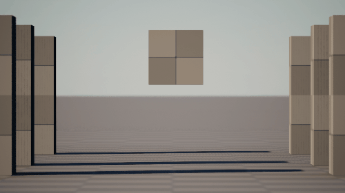
This shot ticks almost all the boxes in terms of flat space. First of all, it has a flat background taking 4/5 of the space behind the actors who are the main subjects of the frame. The background being a wall, we do not see the horizon. The Vanishing Points (VPs) are not noticeable as the image mainly includes vertical and horizontal lines, we don’t get any leading lines. For the staging, almost all the props are physically placed against the wall creating only 2 layers in depth (the actors and the wall), reducing the overlap in the scene. There’s a perfect symmetry in the image, each element is mirrored in the opposite side of the composition which accentuates the one plane staging cue. Soft lighting, selective hue, tonal reduction, you even get reversed depth cues by having a background full of details, textures and human size paintings. By contrast of tone, however, we get a slight separation of the actors from the wall which creates a bit of depth.


Even though this shot was filmed outdoors, it still feels flat. The physical space is limited and the straight angle of the camera combines the multiple perpendicular background layers into one. Actors are staged on top of each other, creating a lot of overlapping. If we look closely, we can identify 3 layers of depth bewteen them but their proximity makes the whole group feels like a real pack of wolves. Covered in mud and blood, the characters really fit in the environment, they are part of it. The tone reduction, the color grading, the dark soft lighting and the aerial diffusion all help to unify the frame.


This example showcases an outdoor shot with visible horizon that feels flat. Notice how the waves and clouds only create horizontal lines making the VP imperceptible. The one plane characters staging combined with the depth of field divides the depth in two layers. The lack of detail, minimalistic set, soft lighting and low overlap is further enhanced by the reduction of tones and blurred background of the shot.


This frame is an interesting mix between the flatness of an organized office interior and the natural depth of the city. On one side we have a small physical space with flat walls and windows and on the other side we got huge buildings fading into fog. The staging divides the depth in 3 layers: the desk, the wall and the city. Though soft lighting, reduced highlights and reversed size change make the indoor flatter, a few cues like overlap contribute to the depth of the shot. The point of view also reveals a few short leading lines. The whole scene is highly desaturated and it creates a sense of rigidity which is enhanced by all the vertical and horizontal lines.

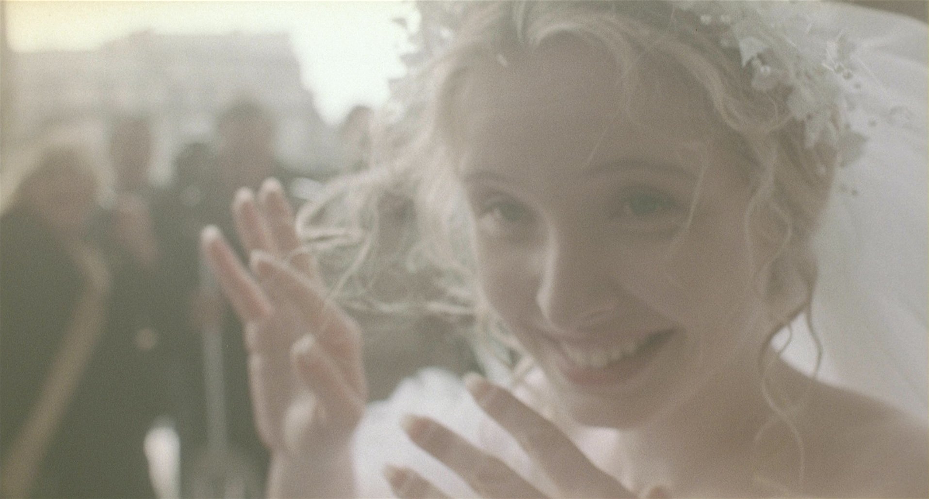
In this shot, one cue is getting the upper hand over the others: focus. By making the whole background of the image blurred, the filmmaker draws your attention to the foreground and makes the cues inneffective. However we can still sense a one plane staging of the actors behind the focus point. Notice how the dark have been lifted and the subject of the frame is not fully in focus. The whole frame feels dreamy. We have here the ideal fantasy of the wedding.


This showcases the easiest way to create flat space: removing any physical depth from the image. To do so, you can frame an actor leaning back against a wall or in this case having a top-down shot of the subject on the ground. Ellie, played by Bella Ramsey, tries to get a sense of security by curling up. Growing up in a post-apocalyptic world, she learned that she shouldn’t trust anyone. This feeling of entrapment is greatly achieved here with flat space. There’s no way to escape, no horizon or lines leading you to an exit door. You just see the ground and concentrate on the character. Notice how the use of complementary colors (red and green) brings out the subject.

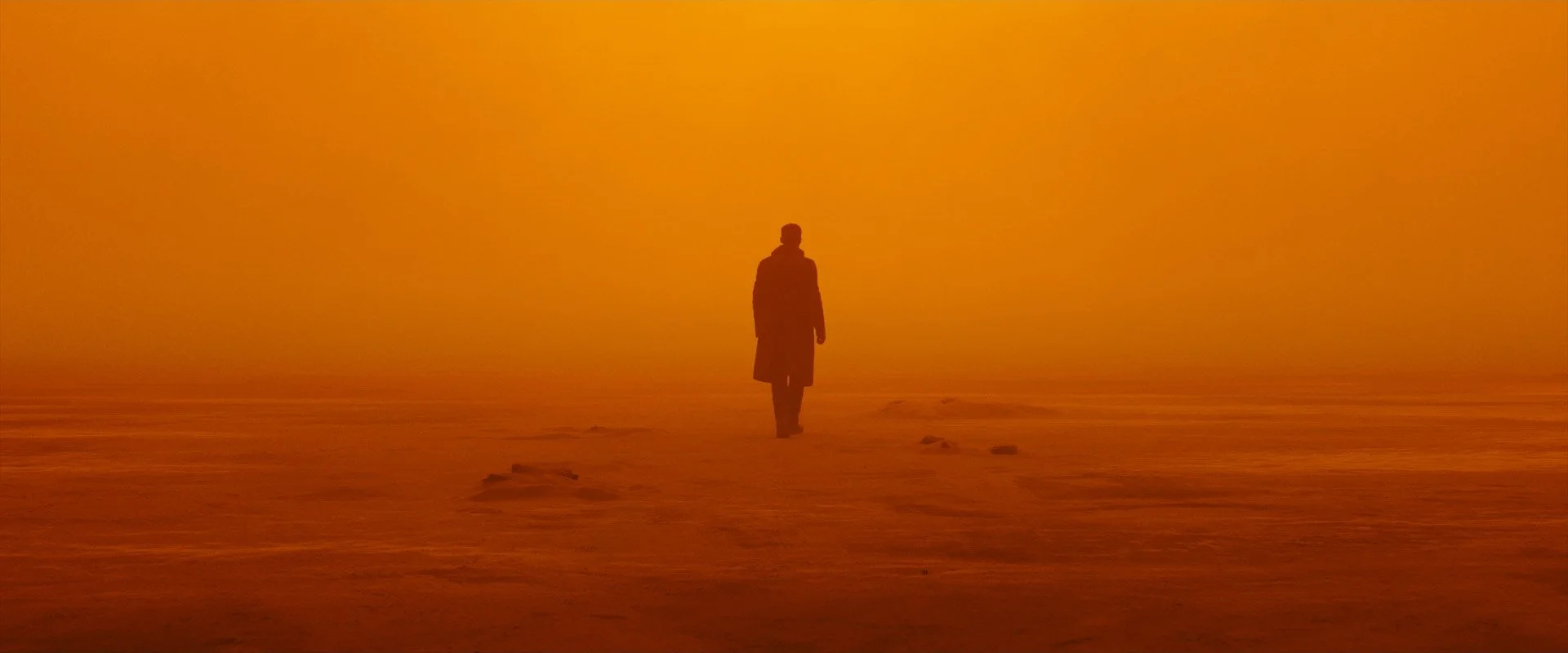
Another cue that can outweigh the others is aerial diffusion. By increasing the fog density to an extreme, you can cover all the distant elements making the fog itself the background. Furthermore the highly selective orange hue also helps blending everything together. The only element standing out from the shot is Officer K, played by Ryan Gosling. Where the environment is static, horizontal and homogeneous, the character is vertical, moving and creates a tonal contrast with its surroundings. The minimalist stagging makes this duality between character and environment the subject of the frame.


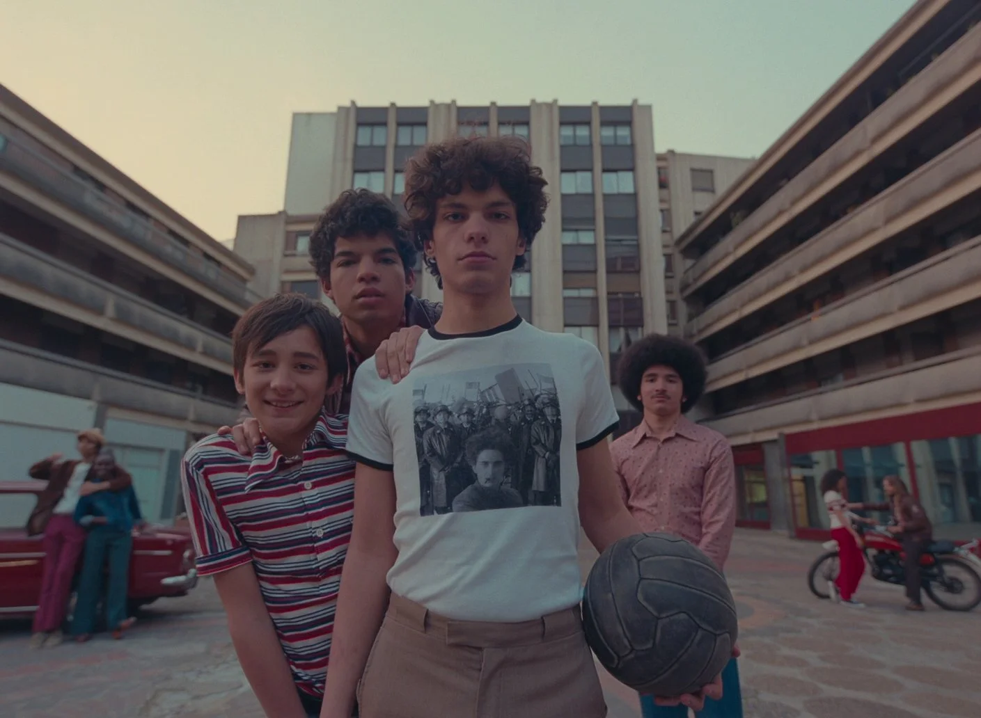
The stagging of this frame is really powerfull and complex. First of all, the depth is divided in half by a physical low wall (we could even say that the front layer is also divided in two: left and right). The subjects of the scene are aligned in one plane in the background and they face the camera. All the other actors in this shot are secondary and used to frame the protagonists. If you look closely, you can see that the focus is on the background making the extras in the foreground a little bit blurry. Moreover, the majority of their faces is hidden from us. To push it a little bit further one of the secondary actor is used to divide the background subjects in two groups. This makes a lot of sense when you get the narrative context of the scene: the two boys on the left assaulted the people on the right after a hit and run. The conflict between the characters is translated into the visual language. A tiny extra detail that feels like this composition has been carrefully planned is that the main characters of the movies, the two boys, are the only ones that we see completely.
The use of telephoto lenses in Mother is quite extensive and we can see how it compresses depth in this shot.
📺 MOVIES FEATURING FLAT SPACES
If you want to push further your studies, here’s a list of movies that showcase an interesting use of flat spaces:
Klute - Alan Pakula
Emma - Autumn de Wilde
Manhattan - Woody Allen
Mother - Bong Joon-ho
Witness - Peter Weir (flat vs deep)
American Beauty - Sam Mendes
Late Autumn - Yasujirō Ozu
Jeanne Dielman 23 Quai du Commerce 1080 Bruxelles - Chantal Akerman
Contempt - Jean-Luc Godard
The Hudsucker Proxy - Ethan and Joel Coen
Flowers of Shangai - Hou Hsiao‑hsien
Sonatine - Kitano Takeshi
Distant Voice, Still Lives - Terence Davies
Maborosi - Hirokazu Kore-eda
The Wes Anderson filmography
🎨 OTHER MEDIA
Movies are only one form of visual art and I believe it’s mandatory for our growth to explore the others.
📷 photographY
Flat space style is often associated with portait and more specifically old posed photography. Such images usually feature a group of people, frozen in time and staged together in front of a flat background. There’s a great sense of “mise en scène” in these shots as if everything was carefully planned. Photographers like Walker Evans was one of the pioneer of flat space composition.


During my research, I came upon the name of Hiroharu Matsumoto. This Tokyo-based photographer working mainly in black and white captures the loneliness of oneself in a giant megacity.
“ With this work I wanted to find the silence that occurs for a moment in a huge public space where many people come and go. ”
Although a big part of his work features high depth created by the city, I still find the flat ones interesting. There’s something uncanny when people are framed in a planimetric way. It feels like they are captive from the composition.
Like a lot of B&W street photographers, Hiroharu is using high contrast which can reinforce the depth but he’s not taking part in the action and he secures his observer’s point of view by using telephoto lenses.


🖌️ PAINTING
Like in photography, portrait paintings are usually flat due to the limited physical depth behind the characters. Backgrounds are often minimalistic and perpendicular.


Like I mentionned in my last article, paintings or drawings can introduce perspective error or unrealistic sense of depth. This is further enhanced when the piece of art is intentionally stylised. The purpose of painting is then not to reproduce the reality but rather to convey a certain point of view or emotion.
Frida Kahlo’s El Autobus showcases an open landscape with visible horizon, size change of trees and leading lines but the subject of the frame - the bus, is quite flat. I get this feeling that the background is fake: a falsy recollection of the bus accident she was involved in. It’s like the bus is a memory stage and that the background is a green wall.

El Autobus - Frida Kahlo
Some artistic movements are defined by their way to depict perspective. In Cubism, the subject is represented throughout multiple viewpoints. By using multiple perspectives at the same time, the cubism painters allowed the art to live outside the space and time constraints. In Picasso’s Guernica and Three Musician, overlapping is happening all over the frame to a point where each character is merged in one and only entity. Without being able to understand the boundaries of the characters it’s very hard to find any sense of depth in those pieces.

Guernica - Picasso

Three Musicians - Picasso
🎮 VIDEO GAMES
In my blog post about deep spaces, I talked about the fact that 3D games inherently have depth because the player is controlling the camera. I also said that games could be sorted based on their type of view. While the majority of new mainstream games are in 3D, this wasn’t always the case. Let’s rewind a few decades ago.
At the early ages of video games, due to technical constraints, all of them were in 2D. The computing power of gaming devices could only deal with a few sprites moving against a fixed background. Throughout the years a few 2D genres emerged with the same ambition: emulate 3D through fake perspective. Most of them are still used today but they evolved.
TOP-DOWN VIEW
Top-down view games might be the flattest type of them all. By placing a fixed camera above the scene at a 90° angle from the ground, you make sure that the only possible depth will occur between the ground and the camera. The character embodied by the player moves most of the time on the ground and the camera is fixed to it.

Pac-man - Namco Studio

Asteroids - Atari Inc.

Space Invaders - Atari Inc.
This viewmode was used by a lot of famous arcade games like Pac-man, Space Invaders or Asteroid and they all have a locked background. Although the environment is seen from the top, the players and ennemies are usually seen from the front. In these games, the player is contained by the borders of the screen. A decade later, the boundaries were broken by Grand Theft Auto, a top down game where the player can wander in Liberty City. The buildings scattered throughout the game enhanced the sense of depth and the camera was following the player.


The top-down view is now a relic of the past that has been used as a nostalgic device in several games. Hotline Miami for instance, an intense top-down shooting game, was released fifteen years after GTA but shares a lot of similarities with his older brother.
SIDE VIEW
Side view was and still is very popular amongst platformer games. Mega Man, Super Mario Bros, Donkey Kong, all of these titles share a common trait: the background is compressed into one flat layer. This implies that the player’s inputs and camera are limited to two axis (X & Y).

Mega Man - Capcom

Donkey Kong - Nintendo

Super Mario Bros - Nintendo
Side view is the type of game that looks the most to planimetric composition (more on this in the Wes Anderson section). This is probably why it’s used by this fan made video game of “The Life Aquatic with Steve Zissou“.
Nidhogg is a side-scrolling two player fighting game released in 2014 that uses the side view as part of the gameplay. Your goal as a player, is to reach the opposite side of the map and prevent the other player to do the same. The world is divided into several maps that have interesting X & Y details but the background is always minimalistic.

Nidhogg - Messhof: side-scrolling game
Out of the four types of games, side view might be the one that’s the most used today. This is probably due to the evolution of the genre. Firstly, while still being constraint to two axis, the background got divided into several layers to create a parallax effect when the player moves.

Cuphead - MDHR : background layers are divided to create parallax

Inside - Playdead: 2.5D game
Secondly, with the rise of 3D technologies, developers started to create 3D games while still using the side view constraints. This shaped the definition of a new sub-genre: 2.5D view. In those, the player is still constraint to move only through 2 axis and the camera is still perpendicular to the XY plane but the world in which he wanders is in 3D. In this genre we can find the great Inside and its predecessor Limbo, the Little Nightmares series or the recent Planet of Lana.
THREE QUARTER VIEW
The three quarter view is a tilted bird’s eye view in which vertical axis indicates both height and depth. It is the gold genre of the gameboy era. A lot of popular licenses like Pokemon or Zelda were build that way. The result of this perspective cheat made the visual looks really flat but it gave the player the impression that the world was bigger than it seemed.

The Legend Of Zelda: A Link to the Past - Nintendo EAD

Pokemon Gold - Game Freak
Notice how the characters don’t follow the same rules as the environment.
ISOMETRIC VIEW
Isometric view is the deepest 2D game type that I could find. The perspective cheats used here are really convincing. By putting each axis at 120° from one another, the perspective lines don’t converge. When you play an isometric game, you get this doll house feeling: everything is too perfect.
Firstly used in simulation, strategy and rpg games for its believable depth emulation, isometric view is now used as part of the art direction.


fez
Fez is a 2012 video game that embraces the constraint of flat space and use it as a gameplay mechanic. While the character is moving in a completely 2D flat space, the player has the ability to rotate the camera, revealing new pathways and clues.

Fez - Polytron Corporation
Now that we saw several examples both in movies and other media, we can dive into the use of space throughout an entire production. Additionnaly to single shot studies, it’s important to put it into context and understand how space evolves from one scene to another. Hereafter, you’ll find how Wes Anderson has been using flat spaces for all his films.
🗺️ WES ANDERSON AND FLAT SPACES
INTRODUCTION
The first director that comes in my mind when I’m thinking about visual identity is Wes Anderson. Vivid colors, meticulous sets, inserts, use of models, planimetric composition, symmetry, nostalgia: his movies all share a sense of visual uniqueness that makes us aware we’re watching a Wes Anderson film. Throughout his career, he completely embraced the use of flat space making it a part of his director fingerprint.
In this study, we will talk about:
The meaning of planimetric composition
How and why Wes Anderson uses flat space
How to stick to flat space throughout an entire production
Realism and Shot consciousness
How to stick to a visual style without being repetitive
Flat space and planimetric composition
Flat space and planimetric composition are two similar concepts. The first one, already dissected in the theory section right above, comes from Bruce Block in his Visual Story book. The second is used a couple of times by David Bordwell in his blog. He defines planimetric composition as “a style involving a frontal presentation of the action” featuring a perpendicular background and characters staged at 90 or 180° from it. It basically includes the most important cues of flat space.
While Bordwell doesn’t mention textural diffusion, tonal and color reduction, depth of field, lighting, contrast or overlap; he definetly emphasizes the use of frontal plane, staging and movements. We can then assume that flat space is a general term that includes more cues than planimetric composition.
In the sixties, filmmakers were more and more prone to use long-lenses due to the growing demands of filming on location. Those lenses created a flattening effect on the depth which led to a new tendency. Having a flatter style was in contradiction with the Hollywood way, making it more singular.

Contempt - Jean-Luc Godard
You can for instance find flat spaces in Late Autumn from Yasujirō Ozu or in Contempt by Jean-Luc Godard, both films were released in the early sixties.
FLAT CUES IN WES ANDERSON’S WORK
FRONTAL PLANES
Rather than getting rid of all the leading lines, Wes Anderson mainly relies on flat backgrounds. Those lines are still visible but the horizon line is hidden by the background. This is partly due to the extensive use of wide angle lenses in his productions.

The French Dispatch
The French Dispatch
Additionnally, inserts - in most case showcasing flat planes - are integral part of the Wes Anderson style.

Moonrise Kingdom
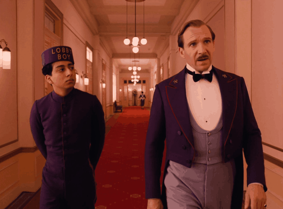
STAGING IN ONE PLANE
Staging is a big part of the Wes Anderson DNA but the characters are not all placed on the same plane. Instead, they are spread accross the depth in several layers* often creating a sense of hierarchy.

The Grand Budapest Hotel

The Grand Budapest Hotel
TEXTURAL DIFFUSION
Anderson’s work showcases a lot of textures and details which makes this cue ineffective. We can see some use of aerial diffusion but it’s often used as a narrative design rather than a visual choice to flatten it all.


Moonrise Kingdom
MOVEMENTS
Movements in Wes Anderson films are usually depicted as unrealistic. On one side, elements in the frame seem to move on an euclidean grid and on the other side the camera is only moving to track those elements which result in a very rigid way of filming.
Characters move most of the time on a specific axis (more on this in the next section) created by the picture plane. They can move parallel or perpendicular to the camera which usually follows them.
The Grand Budapest Hotel - Wes Anderson
For the camera movements, you mostly find wip pans, tilt and zoom, which don’t create depth. Anderson is also known for his extensive use of long tracking shots that can remain flat as long as the background is flat.
The Grand Budapest Hotel - Wes Anderson
TONAL AND COLOR REDUCTION
Most of Wes Anderson’s films feature vivid, bright and saturated colors while talking about serious subject like suicide, death or depression. The color scheme is often reduced to a specific hue.


Though it is not always the case, the tone of the frame is often reduced by 1/3 of the spectrum (the hightlight or the shadows).

The Grand Budapest Hotel

The Grand Budapest Hotel
In his most recent films (The Grand Budapest Hotel, The French Dispatch and Asteroid City), we’ve seen more and more the use of black and white as a narrative device.

The Grand Budapest Hotel

The French Dispatch
REVERSING DEPTH CUES
Regarding reversed depth cues, the amount of details invalidate the textural diffusion but we can find several examples of reversed size change.

The French Dispatch
DEPTH LAYERS AND OTHER FLAT CUES
Depth of field, lighting and overlap are not crucial for a Wes Anderson’s style.
Shallow depth of field is uncommon in Anderson’s work probably due to the use of wide lenses. The lighting is often soft but not exclusively and the way actors are stagged reduces the possible overlap they could generate.
CONCLUSION
We can see that from all the flat cues, Wes Anderson mostly uses Frontal planes, Movements and Color reduction to compress the space in depth. To formulate things differently, even the most flat filmmaker doesn’t use all the flat cues at his disposal because it doesn’t serve the story he wants to tell. Some artistic choices like the use of wide lenses are even increasing depth.
*This will be an important feature of the limited space, my next article’s subject.
FLAT SPACE CONTINUITY
Now that we saw how to build a flat composition, a question remains: how can we assure flat space continuity ? In other words, how to keep flat spaces from shot to shot ?
The answer relies on a concept explained by David Bordwell called the compass-point editing. Throughout the scene, the camera only point toward 4 directions. To preserve planimetric composition you can then cut at a 90°, 180° or use a whip pan. You wouldn’t be surprised if I tell you that Wes Anderson rely on those frequently. The Grand Budapest Hotel might have the record of whip pans used in a movie.

The Grand Budapest Hotel
Dialog scenes in Wes Anderson’s world are almost always filmed that way, creating a sense of confrontation between the two characters.


All of this is great for visual identity but if we stick to all those rules, is there any room for novelty ? When will it be too repetitive ?
It’s interesting to note how Wes Anderson’s style evolved throughout his career. In his early movies, we can see a mix of planimetric composition and more standard composition but in his last movies, flat space is used as a blueprint for the whole production and rules are twisted to fit the narrative needs.
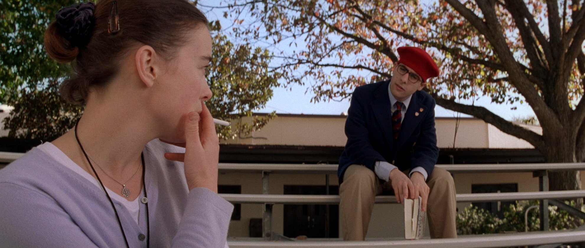
Rushmore - Wes Anderson
This loyalty to flat spaces enables Wes Anderson to play with expectations. The viewer is expecting to find a planimetric shot, a frame that follows the visual rules of the movies. So when an element in the frame deviates from those rules, it is highlighted by contrast.

The Grand Budapest Hotel
Thomas Flight made an interesting video talking about expectations in The Grand Budapest Hotel.
REALISM AND SHOT CONSCIOUSNESS
The visual identity of Wes Anderson divides the audience. Some people love it, some people hate it, saying that the style takes the viewer out of the experience. What they pinpoint here is what David Bordwell calls Shot-consciousness. You are aware you are being told a story and Wes Anderson doesn’t try to hide it from you, in fact he’s even drawing attention to this storytelling realisation. Most of the time, the film starts by introducing the narrator or the book this story comes from. You can also see a lot of architectural models but they are not used in a realistic way, you instantly see that you’re watching a miniature, a doll house. Some of those visual features can also be as extreme as the cartoon chase sequence in The French Dispatch. Actors looking at the camera, parts of the set moving during the scene, characters not where they’re supposed to be: Anderson likes breaking the fourth wall. His last movie brought this feature to a whole new level.
The result is a pure stylized unrealistic filmmaking style. With the extensive use of retro props and sixties music, the visual style and the recurrent theme of parents-child relationship, Wes Anderson’s films seem like there’re coming from a children book.
“For me often what might take somebody else out of it is what I think is just the most beautiful thing”
In his video “Why Do Wes Anderson Movies Look Like That?“, Thomas Flight says “Wes Anderson as a director becomes a character in his films“. By leaving his fingerprints on everything he does and by making us shot conscious, Wes Anderson becomes an invisible character. You can feel him in every scene.
I would go a bit further and say that the space itself is a character in Anderson’s movies. The family house in The Royal Tenenbaum, the boat in The Life Aquatic, the train in The Darjeeling Limited, the hotel in The Grand Budapest Hotel, the city in Asteroid City: like the Overlook Hotel in Shining, each of his film is deeply linked to the space in which the story unfolds. Wes Anderson is a real puppet master that brings spaces to life and shapes their essence through visual composition.
This previous section was about Wes Anderson’s style but we didn’t analyse one of his movies. In the next article, I’ll dive into the flatness of The French Dispatch.
❔ WHY SHOULD YOU USE FLAT SPACE
I would like now to answer what I think is the most important question regarding the use of a visual component: Why should you use it in the first place ? We saw a bunch of use case for flat spaces and I’d like to reflect on them.
Unlike depth cues, flat cues are based on affinity and they can be used as a contrasting device through the concept of Contrast & Affinity I talked about in my first article. But they’re not only useful for comparison. Flat spaces have their own flavor that creates visual singularity and they can serve the story in countless ways. We saw that they have a distinct pictural look very similar to old photography and it might be something suitable for your own projects. Additionaly, they also make your visuals stand out from the Hollywood recipe.
The very definition of a flat space is in fact the lack of it and it’s linked in our collective consciousness to a series of visual stereotypes that you’ll find below. The feeling of entrapment in The Last Of Us or the hard-edged sterility of the wife’s suburban life in Safe are visual stereotypes illustrated by flat spaces.
When sticking to a specific type of space, you create a visual identity that ties your shots together. You can then play with expectation as every deviation from your style will be noticed by the viewer. Like Wes Anderson, you can also use flat spaces for the love of storytelling devices. You want the viewers to be shot-conscious, to let them know that they’re being told a story.
📃 Visual Stereotypes
What I call visual stereotypes are common characteristics associated with a particular visual component. As their name suggests, these are not to be taken too literally and should only give you a place to start. What matters is that you pick a visual component that matches your story’s point of view and that you set up your own rules defined in the exposition.
Visual stereotypes are also culturally and temporally dependent so they can evolve through time and space.
Here’s a list of the main ones associated with flat space:
Stylized
Claustrophobic
Entrapment
Unrealistic
Simplicity
Rigidity
Strict
Indoors
Inner self
Closed
Simple
Calm
Childish
Lack of depth
Two-dimensional
🆓 GUIDES
One of my goals with these blog posts is to build tools to help you grow artistically. For this subject, I’ve made two guides:
The first one is a collection of tips and reminders on how to make flat space.
The second one is a roadmap for flat space studies.
CONCLUSION
Flat space creates visual uniqueness and when used from start to finish, it brings visual identity to your productions. Inherently, flat spaces are less intense than deep spaces because they rely on affinity but that doesn’t mean that they don’t serve a purpose.
Hereafter, you’ll find bullet points that sum up the whole article you just read.
THEORY
Space is pretty important as it defines the place where you'll be able to play with the 6 other components that make up visual structure.
Flat space is defined by flat cues.
We can see flat cues as the opposite of depth cues.
The flat cues are: Frontal Planes, Stagging in One Plane, Textural Diffusion, Movement, Tonal & Color Reduction.
Some depth cues like Textural Diffusion and Size Change can be reversed to make the visual flat.
Frontal Planes is the most important flat cue.
Frontal Planes cue is defined by the lack of leading lines, horizon and vanishing points.
Staging in one plane cue occurs when known size objects like actors are placed at the same distance from the camera.
Textural Diffusion is defined by the loss of details & texture in depth.
Cutting down the amount of elements in your frame reduces the textural diffusion.
Aerial Diffusion can flatten the frame if the density is high enough.
Telephoto lenses compress space.
When moving parallel to the picture plane, elements don’t create depth.
Pan, Tilt and zoom don’t create parallax.
Reducing tones to 1/3 of the values or the color to a specific hue makes the visual flat.
Shallow Depth of Field can compress depth by hiding all the depth cues.
Soft lighting helps blend the layers together.
Less overlap produces less depth.
STUDIES
An easy way to create flat space doesn’t mean it’s not as effective.
Reducing the physical space in your frame is one of the simplest way to flatten the visual.
You don’t have to use all the cues to build a flat space.
When you shot showcases more characters, be aware of the size change cue and use staging at your advantage.
Planning an outdoor flat shot can be tricky, use the set at your advantage to hide the horizon.
Organic and natural environment are less deep, especially when using a little bit of blur to tied everything together.
Depth of field and aerial diffusion can outweigh all the other cues when pushed to a certain point.
Staging can be used to illustrate the relationship between the characters.
Painting or drawing can introduce perspective errors or unrealistic sense of depth leading to flatness.
2D video games can be divided into several categories based on their camera system.
The type of view are: top-down, side, three quarter and isometric.
Top down views bring the most flat visuals.
WES ANDERSON
Planimetric composition is a style involving a frontal presentation of the action featuring a perpendicular background and characters staged at 90 or 180° from it.
Planimetric composition and flat space are two similar concepts. The first includes fewer flat cues than the second.
Flat space in filmmaking came from the use of telephoto lenses and the intention to move away from the Hollywood approach.
While sticking to the planimetric way, Anderson prefers to shoot with wider lenses.
Due to the restrictions of the physical space, inserts are usually flat.
Flat camera movements are usually depicted as unrealistic.
Even the most flat filmmaker doesn’t use all the flat cues at his disposal because it doesn’t serve the story he wants to tell.
To keep planimetric composition from shot to shot, Wes Anderson uses compass point editing.
Compass point editing only allows you to point in four directions using 90° or 180° cut or whip pans.
Shot-consciousness happens when the visual or narrative choices made by the director remind you you’re watching a movie.
📚REFERENCES
All the shots used in this article are coming from Shotdeck.
FLAT SPACES
DEPTH LAYERS AND SUBJECT SEPARATION
PHOTOGRAPHY
PAINTING
VIDEO GAMES
WES ANDERSON AND FLAT SPACE
The Wes Anderson Collection, Matt Zoller Seitz
The Wes Anderson Collection: The Grand Budapest Hotel, Matt Zoller Seitz
The Wes Anderson Collection: The French Dispatch, Matt Zoller Seitz
“Why Do Wes Anderson Movies Look Like That ?”, Thomas Flight
⏭️ ROADMAP
Here’s the roadmap for the articles of the series.
The Visual Journey: Flat Spaces
The Visual Journey: Ambiguous & Limited Spaces
The Visual Journey: Surface Division
The Visual Journey: Aspect Ratio
The Visual Journey: Lines & Shapes Study
The Visual Journey: Tone Study
The Visual Journey: Movement Study
The Visual Journey: Rhythm Study
The Visual Journey: Color Study
And more....