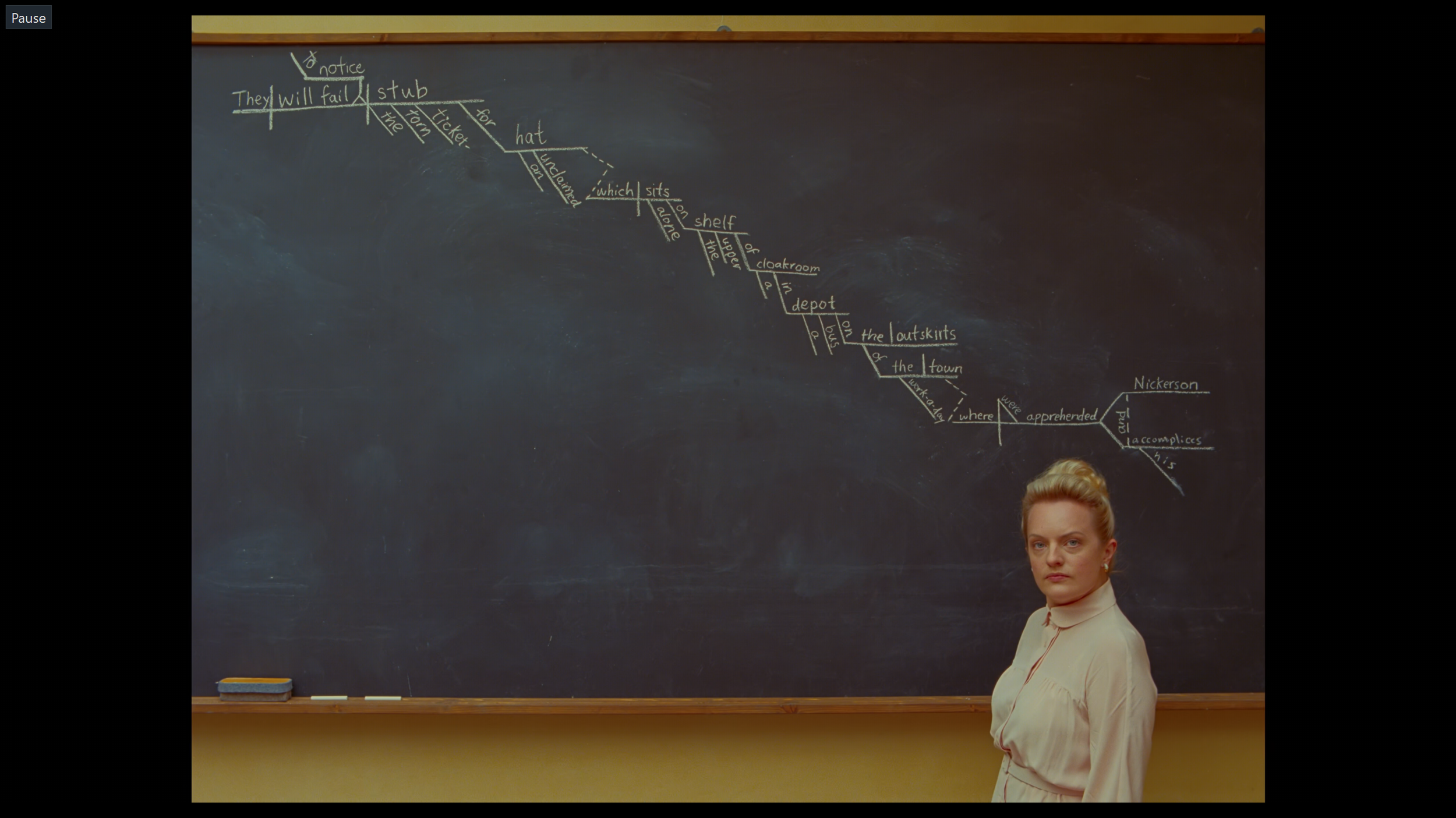
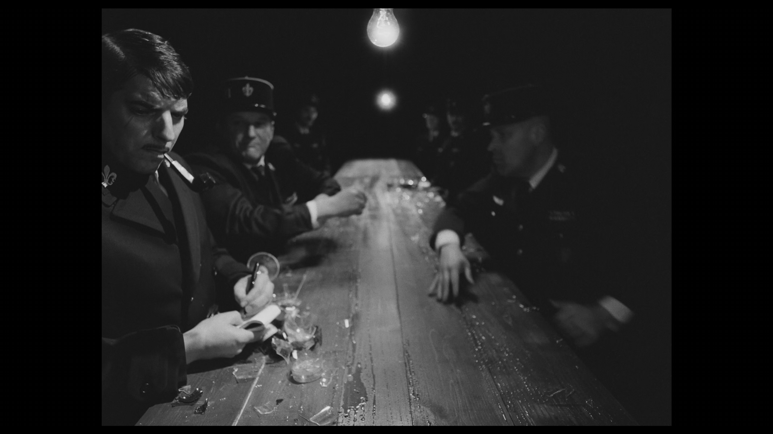
THE FRENCH DISPATCH: A FLAT SPACE ANALYSIS
This blog post is part of a series that dives into visual structure. The last article was about flat spaces. If you want to see what’s coming after this one, look at the end of the page.
💬 INTRODUCTION
Hi there, my name is Arthur Tasquin and I'm a realtime artist working in the VFX industry. This is the chapter 2 of a series of articles called The Visual Journey. In these articles I talk about visual theory and how we can dissect it to use it in our own work. My goal is to experiment and document my learning process regarding visual structure. All the sources I used to develop this article can be found in the end of the page. Though, I encourage you not to take them or this post as an exhaustive list or a one and only way to apply visual structure to your work. This is only a path amongst the grande scheme of visual theories and you should not take it for granted as art is not something you can completely theorize (fortunately). It should only help you expand your current knowledge or even become the beginning of a wonderful journey.
The structure of these articles is based on a book of Bruce Block called Visual Story which I talked a lot about in my first blog post. The one you’re currently reading takes flat space theory as a framework to analyse The French Dispatch by Wes Anderson. For that reason, I suggest you give a look to the previous entry of the Visual Journey.
That being said, we can begin.
🔗 TABLE OF CONTENT
🗞️ THE FRENCH DISPATCH
⚠️ SPOILER ALERT: this article contains spoilers about The French Dispatch.
In the first chapter of The Visual Journey, I talked about the concept of Contrast & Affinity and how the visual components you choose should always support the story. On one hand, contrast of visual components increases visual intensity and on the other hand affinity decreases it. They can both help you convey a certain emotion at a certain time by comparing visual components. The choice of components needs to be driven by the story. You first need to know what you want to say before picking one component over the others. I also talked about how you can set your visual rules during the Exposition to help the viewer understand your point of view.
In this study of the French Dispatch, I’ll go over 4 cues related to flat spaces that evolve throughout the film. Using visual structure graphs, I’ll show you how they influence the flatness of the frame and we’ll try to figure out the meaning behind certain visual choices. Analyzing these cues is very interesting because Wes Anderson’s own visual identity is based on it. Therefore, we can even doubt that we will find any deeper meaning.
PERSONAL REVIEW
The French Dispatch is my favorite Wes Anderson movie. I often describe it as the most “Wes Andersony” film he ever made. I feel like he pushed his style to its paroxysm and we get to enjoy it in every shot. As David Borwell puts it in The Wes Anderson Collection: The French Dispatch, “Every scene a uniquely memorable moment, every shot an arresting pictorial event… His tendency toward pictorial tableaux likewise emerges flagrantly here.“
The movie reveals itself through multiple layers of density:
Density of the visuals: the crowdness of the “mise en scène“ gives the viewer a lot of things to look at.
Density of the information: the pace of the dialog and the voice-over is fast.
Density of the narratives: The French Dispatch is divided into four stories that all have their own characters, temporality, stakes and climax.
Density of the storytelling devices: While the stories are coming from a magazine, each one of those is unfolded through a different storytelling device. The Concrete Masterpiece is a live lecture at The Clampette Collection, Revisions to a Manifesto is a vizualisation of Krementz’s journal and showcases a play she translated and The Private Dining Room of the Police Commissioner is recited in an interview of the author.
This density is often depicted as a bad thing by critics as it puts at risk your understanding of the plot. With so many things happening at once, you’ll certainly miss information and you won’t be able to totally get it in one viewing. Though I definitely felt overwhelmed during my first viewing of The French Dispatch, I also got excited to be immerged in a world that has its own set of rules. Sure, I missed a lot of things, but I got to experience it raw, from start to finish with awe. To this day, everytime I watch it, I discover new details that make the world of Wes Anderson more authentic and believable.
As a Wes Anderson fan, I often wonder if his next movie will be repetitive. Having a strict set of rules is really effective to create a distinct identity but you can fall into the trap of “déjà-vu”. However, on top of refining his visual style, Wes Anderson introduced novelty in The French Dispatch. Here’s a non-exhaustive list of the things that make this movie unique:
Frozen frames
POV shots
Use of looser camera movements
Strong lighting and contrast
A whole cartoon sequence
Amount of actors
Extensive use of Black & White
STORY
The French Dispatch narrative structure is on a macro level not that complicated to grasp. The movie is divided into five chapters dictated by the magazine layout: The first one is the editor narrative arc and the others are stories from within the magazine. Like in many of his films, Anderson intersperses each one of those stories with a title card that creates a clear cut for the viewer.
Arts And Artists: The Concrete Masterpiece
Politics/Poetry: Revisions To A Manifesto
Tastes & Smells: The Private Dining Room
Things get more complicated when you look at the stories themselves because they are filled with digressions and time jumping, covering from a few days to several years. As stated before, each one of them is narrated through the prism of a different storytelling device. They differ by their use of time, featuring flashbacks, flashforwards or sometimes both in the same shot but they all finish the same way: Howitzer reviewing the article.
As you’ll see below in the Timeline and Shots Sheet, I’ve divided the movie in 6 parts. The Howitzer arc contains the Introduction in which he’s discussing the next issue of the magazine and the Declines & Deaths that brings back all the writers together on his death bed. Local Color is the first article of the magazine that introduces the fictional Ennui-sur-Blasé city and the three other parts are the main stories of the film.
This timeline is meant to depict the disparity of temporalities in each story. The X axis is the chronology and the Y axis lays all the stories as they are told to us, from start to finish. Sometimes it goes forward and covers a few months, sometimes it goes backward and covers a few years: that’s why the use of time gap (in grey) was necessary. Moreover, I only showcased the period of time those stories cover but not the back and forth between storytelling devices. The Arts And Artists chapter for example, switches from the lecture to Mose’s story and vice versa 16 times.
As the timing of all events isn’t specified, you should not take this as a precise data but more as my own guess of how the story unfolds. Some settings like the lecture or the interview have no specific date but we know that they take place in the future, after the death of Howitzer.
A shots sheet is a collection of shots from a movie.
FLAT CUES & VISUAL STRUCTURE GRAPHS
While analyzing the flatness of The French Dispatch, I realised it would be easier to break it down into the following cues: Frontal Planes, Staging, Colors and Movements. Each of those will have it’s own section below.
As for the other flat cues, Wes Anderson’s style is based on intricate sets and sharp focus so Texture Diffusion and Depth Of Field are very rarely evolving throughout the movie. In an interview about The French Dispatch, Robert D. Yeoman, cinematographer and long time collaborator of Anderson, says “Wes prefers having much more depth of field than most directors I’ve worked with”. He describes the technical implications of Wes Anderson’s style: using old school dollies and big stops to keep the entire set in focus. On the frozen frame scenes, they even had to shot it at T11 which implies much more lighting than usual.
Visual structure graphs are diagrams that can help you visualize the variations of visual components through an entire production and contextualize those variations with the story intensity. A graph can take the shape of a constant, a progression (positive or negative) or used with Contrast & Affinity.
Aligning the story graph with any other graph can help you see how the visual components support the story. The story graph below shows us that each story features a progression in terms of intensity but the other three graphs don’t seem to follow the same rule.
General and micro progression.
Convergence doesn’t follow the story’s intensity.
The number of people is high throughout the 3 main stories.
The 3 stories are mostly in B&W except when Zeffirelli is the narrator.
FRONTAL PLANES
Frontal planes or the lack of convergence is a common feature in a Wes Anderson movie and The French Dispatch is no exception. However, as David Bordwell explained it in his blog posts, Wes is more religiously sticking to planimetric composition. The difference here is that the background is almost always a frontal plane but Anderson allows leading lines. This requires a specific attention on set building and scouting. No less than 130 sets were built by Adam Stockhause along with the Art Department and a dozen miniatures by the Piercefilm productions team. According to Yeoman, their most ambitious set was the back wall of the French Dispatch building which is a 13 meter high facade.
The use of meticulous crafted set, miniatures and comic book sequences bring this two dimensional look we’re used to see in a Wes Anderson movie but it is contrasted by highly deep shots throughout the stories. Let’s get into that.
Introduction: This is the exposition of the movie, it sets the tone and rules. That’s why 86% of the shots are highly flat.
Local Color: This part still showcases a majority of flat shots but the setting is prone to depth. When miniatures or built sets are not used, the lines created by the city perspective enhance the convergence. We can witness this during the POV shots on the bike.
Arts And Artists : While most of the shots are flat, the story still features convergence in some parts of the prison (max security unit, entrance), when violence/anger is used (POV, murder and Cardazio’s sermon) and in court.
Politics/Poetry: In this story, the Mitch-Mitch play is especially flat due to the planimetric set dressing and some of the shots from “Le Sans Blague“ café are so crowded that we can’t see convergence. Zeffirili and Mitch Mitch’s parents home, the local library and the POV sequence all emphasize convergence but the most deep shot is certainly during the barricade sequence when we see the police’s headquarter.
Tastes & Smells: Just like the whole movie, this story is made up of flat shots but the emphasis is laid on the kidnapper lair. During the shooting, the depth is so compressed that it looks like a collage. On the other side of the spectrum, the introduction happenning in the maze-like police station has extreme convergence.
I’ve come to the conclusion that the three main stories use depth or more specifically convergence in the same way. The depth is limited to the complex world of the adult. If you pay attention, deep shots are often associated to institutions like the prison, the court, the police head-quarter or the police station. We also see this with parents home, local library and violent or more energetic scenes.
This doesn’t surprise me as Wes Anderson’s movies are often depicted as stories coming from children books. The way everything is controlled and perfectly placed in the shot, the acting, the movements, the storytelling devices: all of these contribute to put the point of view of the film inside a child’s head and the depth is also used in that way.
COLORS
The production originally wanted to use only a few B&W* shots throughout the movie but after seeing the tests they made in the edit room, Anderson and Yeoman, driven by the French New Wave influences, decided to use it for the majority of the scenes. This is interesting to note because one of the pillar of Anderson’s style is the use of bright and vibrant colors.
During my first viewing of the French Dispatch, I thought the shift between B&W and color was very confusing. I couldn’t find a logical and objective reason behind this and I think that’s where I was wrong. The movie use of color is twofold: the first one indicates a change of temporality or storytelling device and the second one is a very subtle and elegant way to punctuate emotion. When asked about it, Robert Yeoman said: “I think Wes used color to emphasize or to dramatize certain things“. The lack of clarity in that regard comes from the exposition. The use of B&W in the introduction is reserved for a past sequence and we reassert this association during the first story where past and future are literally side by side in the same frame. The past is in B&W and the future is in color but it’s not always the case. Out of the four shots, one of them is reversed: the past is colorized and the future is not. I think this is the way Wes shows us that the correlation is not to be taken to literally, colors will be used more loosely in this movie.
The past is in B&W and the future is in color
The past is in B&W and the future is in color
The past is in color and the future is in B&W
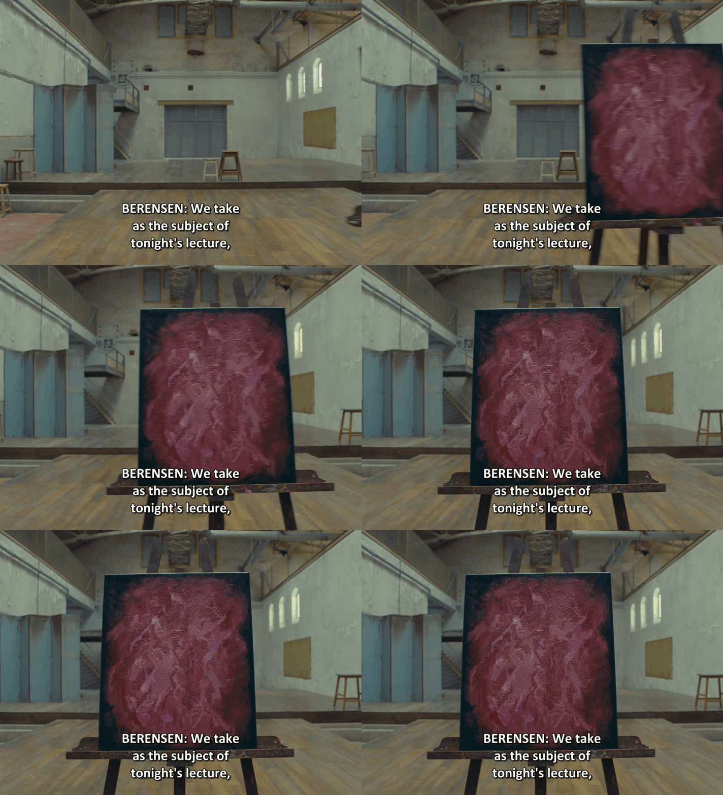
I’ve come to a reasonable understanding of this topic in the movie and I find that The Concrete Masterpiece is the story that uses it the most elegantly. The story is filled with time jumps between the article in B&W and the Berensen Lecture in color which happens 20 years later but where it gets really interesting is the use of color inside the B&W sequences. The first one of those happens early in the process in the very first scene: Simone and Moses leave the room and we hear the click of a projector slide along with the voice of Berensen. For a few seconds, we have a feet in both timelines: the setting belongs to the past but the future bleed in through the painting.
The Concrete Masterpiece: first scene and color switch
The Concrete Masterpiece: first scene and color switch
For his first story, Wes Anderson choses to emphasize the beauty of art through color. The paintings act as a portal from one temporality to another and a device that links everything together: Moses to Simone, the past to the future, the elitist art society to the penal system. And it makes sense to me as when you look at a painting that speaks to you, you dive into the mind of an artist who might have lived at a total different time.
Additionally to the use of color, some dialogs reinforce the effect. When Moses has a revelation about his next work, Simone asks “What do you want to paint ?” and he answers “The Future” while the image turns to color. Similarly, at the end of the story, while Moses talks about his work, he says “It’s all Simone” because for him Simone is the art.
The next two stories both have their own use of color. Like The Concrete Masterpiece with art, Tastes & Smells use color to emphasize the food and some specific moment just for the sake of it. My favorite one is when Gigi says: “What color eyes do you have? Blue?” and the image switches to reveal the color of the girl’s eyes. This part is also interspersed with an interview of the author in color because the storytelling device changes. As for the second story, the use of color is reserved for the scenes that Krementz didn’t live directly but through the point of view of Zeffirelli.
Robert Yeoman mentionned that “Wes wanted each story to have a very specific look, so they would appear to have been written by different writers.“ We can definitely see that through the use of color but that’s not the only visual feature they played with. Lighting, contrast and aspect ratio also contribute to the individuality of each story.
*Black & White
STAGING
The Wes Anderson Collection: The French Dispatch shines a light on the extras in a chapter called “Extras, extras! Read all about them!“. I think it sets the tone as The French Dispatch contains the most crowded shots I’ve ever seen in Anderson’s filmography. I’m talking about the intricate sets of the Sans Blague café where students navigate at a high pace or the several frozen frames where actors are staged not only horizontally but also vertically (probably motivated by the 4/3 ratio). The composition feels nested as if Wes Anderson was playing Lego with the elements of the frame.
When there’s no convergence, the next cue that can help you flatten the frame is Staging In One Plane. While it’s used extensively throughout the film, the amount of actors implies to stage them in depth. However, as with depth of field, the Overlapping cue can be as much beneficial as detrimental to the sense of depth in the frame. When increasing its intensity greatly, bodies start to blend together into a homogeneous shape, almost looking like Picasso’s Guernica.
I noticed three ways Anderson tackles staging of actors:
The first one usually happens when there are only a few characters in the frame. When it’s the case, Wes uses the good old Staging In One Plane, putting all characters at the same distance from the camera.
The second one happens when the amount of extras is increased but the shot is wide and the actors have room between them. Actors are staged in several planes in depth. This is mostly noticeable in The Concrete Masterpiece.
The third one happens when the shot is crowded and narrow or during high intensity or violent scenes. We don’t see actors as singular but as part of a whole. Every story has its crowded scenes: the frozen frames and the art collectors visit in The Concrete Masterpiece, the opening scene, the Sans Blague Café and the barricades for Revisions to a Manifesto, the shooting and the police station for The Private Dining Room.
MOVEMENTS
Wes Anderson’s camera movements are usually very minimalistic. As mentionned above, he only uses old school dollies - which creates rigid movements. The French Dispatch is made up of a majority of static shots, a few zooms, inserts, POVs, whip pans but most importantly tracking shots. Those are the key movements that Anderson uses in all his movies.
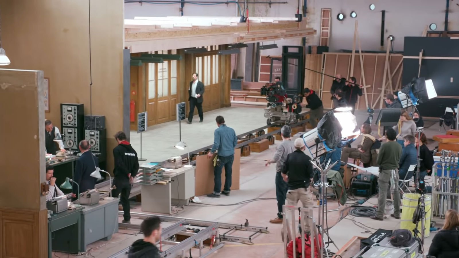
One of those, the lateral tracking shot at the beginning of The Private Dining Room, was the most complicated shot Sanjay Sami, key grip of the movie, has ever worked on in his life. A completely new system of dolly had to be built to allow the complex 80 seconds tracking shot to exist. The challenge was twofolds: the shot was very long and the camera had to move through several axis without any cut. Sami built a setup inspired by a wooden toy train sets that basically would allow one dolly track on top of another one.
Anderson also innovates in The French Dispatch by introducing looser camera movements than usual. The use of POV shots can be seen on the bike in Local Color, when Moses chase Cardazio, at the end of the chessboard revolution, when Wright reads his invitation or during the animated scene.
Moments of high intensity in the stories are illustrated by a documentary style. You feel the conflict between Moses and Cardazio, Krementz and Juliette or the distress of the kidnapper when he realizes that the police is down the street through the unstable and shaky camera.
Lastly, there are a few moments when Anderson lets go his planimetric approach to get back to a more traditionnal way of shooting. The interview in the third story is a dialog between Wright and a host of a TV show that is seen through the cameras used in that context. That means there’s a reason behind the use of over-the-shoulder shots.
We can also see this during the chessboard revolution, when Krementz and Juliette are arguing and it’s something Wes Anderson usually does during emotional moments in his movies: he temporarily hides his style to leave the room to the actor’s performance. This subject was covered in one of Thomas Flight’s video, he says: “it’s a unique effect and it wouldn’t really be possible if Wes weren’t building up so many layers of stylized artificiality to begin with”.
CONCLUSION
The French Dispatch showcases multiple layers of density that makes it perfect to analyse.
Through the use of B&W, POV shots, frozen frames, high contrast, looser camera movements and a lot of actors, Wes Anderson innovates.
The four flat cues evolving throughout the production are: frontal planes, colors, staging and movements.
Convergence is used to depict the complex world of the adult, the institutions like the prison, the court or the police station.
Most of the film is in B&W and the use of color is twofold: the first one indicates a change of temporality or storytelling device and the second one is a subtle way to punctuate emotion.
Wes uses Staging In One Plane as much as possible and finds a way to keep a flat space through crowdness by stacking every actor on top of the others.
The French Dispatch features one of the hardest tracking shot Wes Anderson ever made. While pushing his style to the next level, he also innovates by introducing looser camera movements, hiding his visual signature to focus on the emotion of the moment.
REFERENCES
All the shots used in this article are coming from Shotdeck.
The Visual Story: Creating the Visual Structure of Film, TV, and Digital Media, Bruce Block
The Wes Anderson Collection: The French Dispatch, Matt Zoller Seitz
The Wes Anderson Collection: The Grand Budapest Hotel, Matt Zoller Seitz
Designing The French Dispatch: An Interview with Production Designer Adam Stockhausen, Max Winter
If you want to see more about my visual journey don’t hesitate to reach on Linkedin. I would be glad to connect. You can also subscribe to my newsletter.
⏭️ ROADMAP
Here’s the roadmap for the articles of the series.
The French Dispatch: A Flat Space Analysis
The Visual Journey: Ambiguous & Limited Spaces
The Visual Journey: Surface Division
The Visual Journey: Aspect Ratio
The Visual Journey: Lines & Shapes Study
The Visual Journey: Tone Study
The Visual Journey: Movement Study
The Visual Journey: Rhythm Study
The Visual Journey: Color Study
And more....


